Graphic Design Tips for Beginners
Designing greeting cards, custom booklets and direct mail for online printing can be intimidating, but it doesn’t have to be. If you’re new to design, begin here with our graphic design tips for beginners.
No matter your project or level of experience, Smartpress simplifies the process with our easy online ordering platform and a team of print experts happy to guide you along the way.
Check out these design tips for beginners or anyone wanting a quick refresher.
Color, Color, Color
What’s the first thing you notice about a print piece or design? The color! Our graphic design tips wouldn’t be complete with that, and you might be surprised just how crucial the right color palette can be.
When choosing yours, one thing to consider is the emotion or action you want to elicit from the recipient. If you want an awareness campaign to appeal to people’s emotions, you might choose a cool palette. If you want a marketing campaign to result in sales, a warm palette might add an energetic spark.
Not sure which colors to choose? Experiment with both cool and warm tones and see which one makes the most sense. We recommend focusing on one primary color and then adding complementing colors.
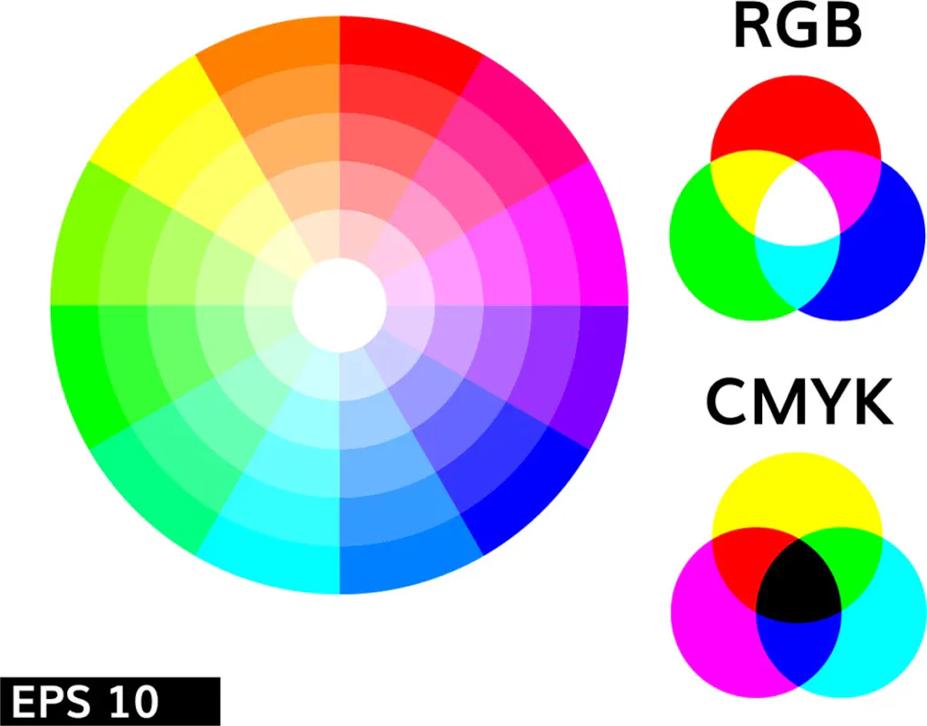
Hint: Use a color wheel to visualize cohesion between multiple colors.
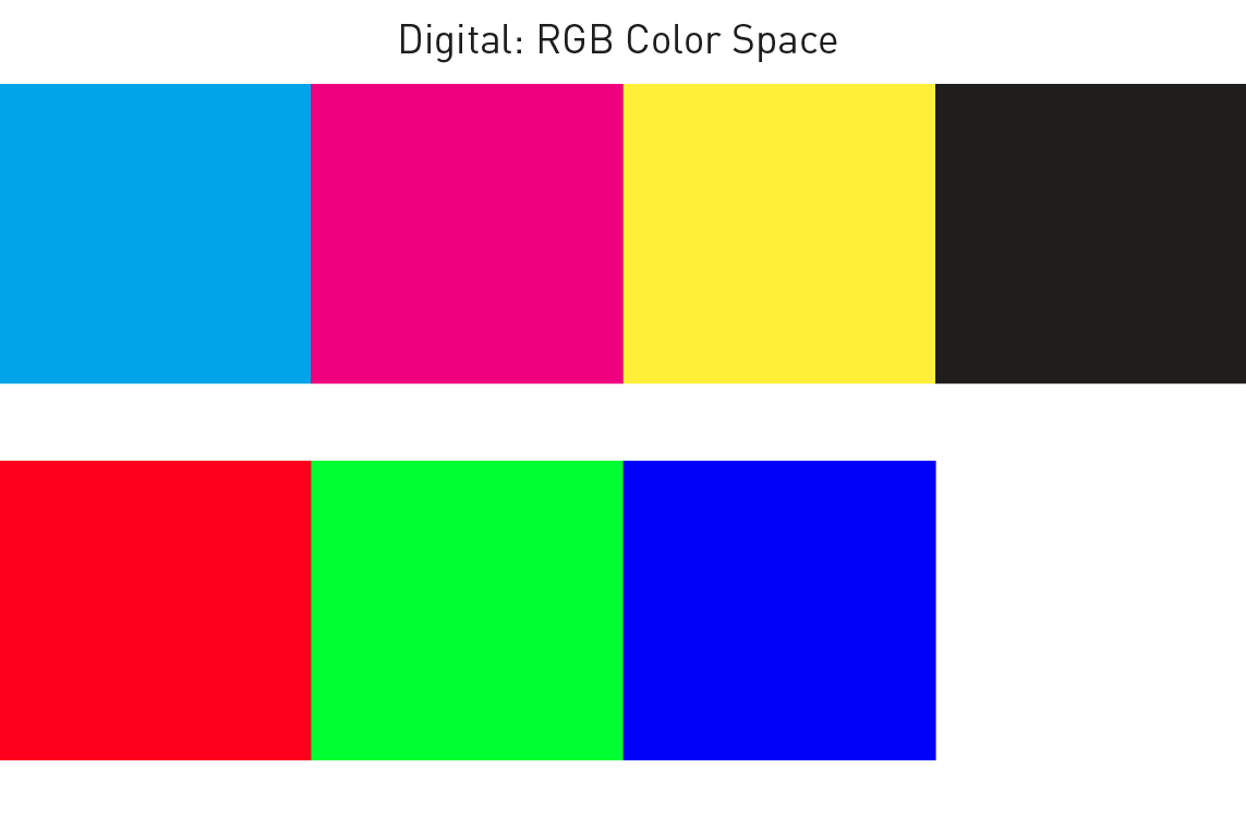
Understanding CMYK and RGB
So you’ve got the palette but what about the color space? It’s easy to pick the one that’s right for your project, as long as you know what you’re designing for before you begin: the page or the screen.
For print projects you’re designing with an online printer like Smartpress, you’ll want CMYK. It uses cyan, magenta, yellow and black to create the colors you want when printing. CMYK is a subtractive color space, so with each added color, more light is removed and the darker your final color will be.
For digital designs, RGB is the color space for you. It combines red, green and blue in various degrees to create the colors you want.
Hint: You can convert your design from one color space to the other. However, be aware that your original colors may change and you may have to adjust accordingly.
Flat Design
Characterized by a simple, minimal style, this design approach gets straight to the point. Great for efficient, direct messaging, flat design is two-dimensional and has an emphasis on usability and functionality – there’s no fluff, every element has a purpose.
Rely on Lines
The humble line. It’s a basic element that can make a big impact on your printed piece or digital graphics. Whether you use lines for style or to create order within your design, they’re tools you’ll want to utilize for:
- Separating content
- Setting boundaries between elements
- Guiding the viewer’s eyes to a focal point or main message
- Creating a logical flow through your design
- Drawing attention to elements, words or phrases
Focus on Fonts

For marketing materials or personal stationery, there’s nothing worse than text you can’t read. That’s why font selection is key to your design. When determining which fonts you’d like to use, we recommend sticking to just one.
However, if you have headers, titles and body text, variations from the same family of fonts will create cohesion as well as distinction.
Take time to experiment with different fonts, and remember: too many fonts decreases readability and the success of your design.
Element Alignment
The way you align and arrange your design elements is part of the message you want to convey, too. With proper alignment, you get a professional look instead of a disorganized one. You can align your elements in different ways:
- Horizontal
- The left, right or both margins are equal.
- Great for specific elements or an entire page.
- Look out for “rag,” or an uneven margin.
- For example: A text column is left justified and each line ends at a different length, creating uneven white space. You can fix this by making manual line breaks.
- Vertical
- Design elements are lined up with the top, bottom or both margins.
- Great for a specific design or an entire page.
- Edge
- Elements are lined up with each other’s top, bottom or side edges.
- This option is not affected by the page margin.
- Center
- Elements are aligned along the center axis.
- This option is not ideal for designs with a lot of text – each line begins in a different place and can decrease readability.
Hint: Take advantage of grids and rulers in workspaces like InDesign, Photoshop and Illustrator to get your alignment just right.
Work with White Space
Also referred to as negative space, white space can get a bad rap. But depending on your design and intention, it’s not always a bad thing. We recommend making good use of white space to:
- Increase readability. The more white space you have, the easier it is to see and focus on your content.
- Create a clean look and add balance and symmetry to your design.
Above All, Be Consistent
No matter what you’re designing, consistency is key. It helps you differentiate campaigns and can even ensure you and your business stand apart from other brands. So how do you do it? We recommend you pay attention to the following:
- Decide on colors, fonts, font size, spacing and alignment and stick to them.
- Ensure all of your design elements connect to each other and create cohesion. From text to artwork, they should all work together to convey your message.
If you’d like help creating your design or want to discuss design ideas, reach out to our Layout Services team. Our dedicated designers are happy to help you bring your projects to life.
If you have questions about graphic design tips or any of our online printing services, please contact customer service.