Digital Color vs. Print Color
Why Don’t My Print Colors Match My Screen?
As you design your custom books, personalized calendars, direct mail marketing and more, you might come across color discrepancies between the digital color and the print color.
Ever wonder why there’s a difference between what you see on your screen and what you see on your printed pieces? This is a common question in the online printing world, so we’ll explain why this happens, designing in CMYK vs. RGB for print and digital, what affects your colors and offer tips for getting them to match as closely as possible.
What’s the Difference Between Digital Color and Print Color?
When it comes to colors, the first thing to know is that digital screens and computer monitors display them in one color mode, RGB (red, blue, green), while printers display them in another, CMYK (cyan, magenta, yellow, black). Thus, the digital color you see on screens can vary from the print color you see on paper and vice versa.
What is RBG for digital screens?

Monitors mix red, green and blue (RGB) colored light to display colors. RGB has a larger color gamut space than any other method of imagery. This is also referred to as additive color.
What is CMYK for printing?
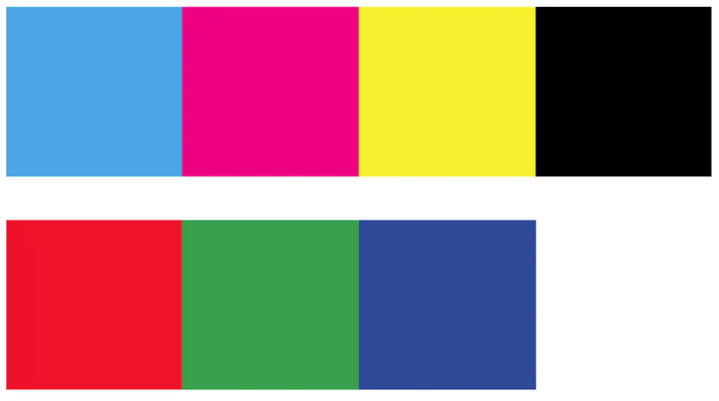
No matter which printing method you use, they all mix cyan, magenta, yellow and black (CMYK) in the form of small dot patterns to create shape and color. This is also referred to as subtractive color.
Some print devices have additional ink channel capabilities to extend the color gamut in order to reproduce a larger range of color. However, this larger range of color often results in higher pricing, too.
What is Color Space? Why Does it Matter for Digital vs. Print?
Is your project intended for digital viewing or will your audience and recipients be handling it physically? It’s crucial that you know your intent before you begin designing with our online printing services.
Digital color spaces are RGB-based and come in many different types, called ICC profiles. Printing profiles are CMYK-based and can even be multichannel, depending on how many colors are used.
Smartpress Tip: As you go through file color setup and create your print-ready file, we recommend using the CMYK color space. Here are a few examples:
- Coated GRACoL 2006 (ISO 12647-2:2004) (coated stock) over GRACoL2013_CRPC6.icc (coated stock)
- GRACoL2013UNC_CRPC3.icc (uncoated stock)
Hint: These color spaces in particular are what almost all U.S. based print companies are targeting and capable of producing on the respective coated or uncoated stock.
How Designing in RGB vs. CMYK Affects Your Final Printed Colors
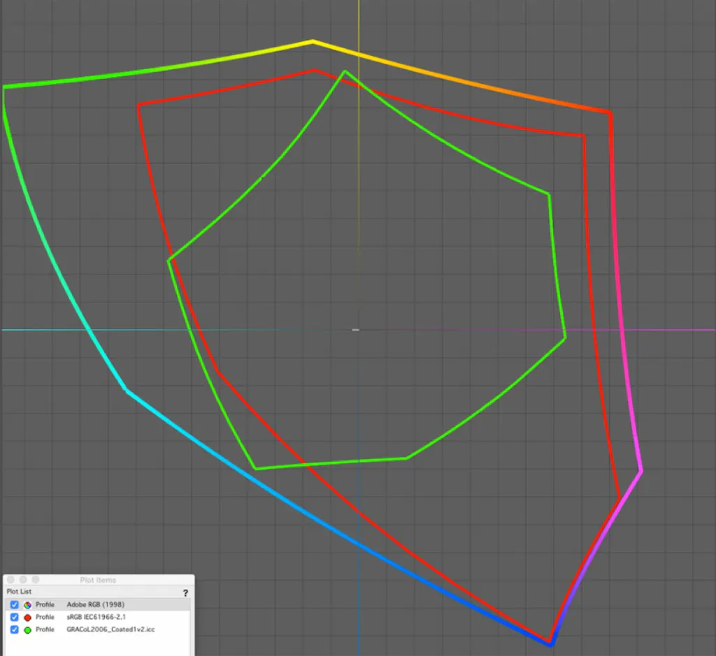
If your art is designed in an RGB workspace, you have the potential to create or use digital colors that are not achievable in print. Because the RGB color space is significantly larger than CMYK, so too can the gamut of color, as depicted in the diagram below.
Hint: The key in the lower left corner indicates the profile spaces.
Lighting Affects Color Accuracy in Print
Simply put, lighting is everything. When assessing and reviewing your printed projects, we recommend doing so in a brightly lit environment.
You can do this under daylight-colored bulbs or in actual daylight. These lighting specifications are important because color management systems are calibrated and designed around daylight viewing conditions – you’ll get the best results if you do the same.
Smartpress’ Color Matching Capabilities
As a premium online printer, we use a color management software that helps match digital and printed colors as closely as possible. Here’s how:
- This software measures the capability of our printers and master stocks to create printer profiles.
- Files are converted from the color space included with the artwork into the printer profile color space.
- Dynamic rendering varies the calculation method based on the color, in order to retain the hues when deciding how to convert them into the printer color space.
- This helps minimize unavoidable color conversion loss. Color can be lost with static rendering intent algorithms or basic color conversion engines typical in design application software.
Smartpress Tip: Always store your reusable projects in a safe place because Smartpress’ color matching capabilities mean you can reorder the same print years later and it’ll match.
Design Tips to Avoid Color Discrepancies in Your Print Projects
Tips & Tricks
To avoid or decrease the chances of color discrepancies on your project, consider these design tips:
- Design in a CMYK color space (we recommend one of the three listed above).
- When choosing paper stocks, the whiter the better. Coated stocks will provide a higher range of color and contrast, while in comparison, uncoated stocks will mute colors and limit vibrancy.
- Calibrate your computer monitor or digital screen as much as you can with monitor calibration tools.
- For consistency over time, build your branding logos and corporate colors using Pantone colors:
- Be sure to choose from the correct library and select coated or uncoated to match your paper choice.
- If brand colors are derived from Pantone colors, keep them as spot colors with the standard Pantone nomenclature – do not edit their color values.
- Remember, not all Pantone colors are achievable using CMYK.
- Reference the Pantone Color Bridge book to choose a color that looks similar in both CMYK and spot colors. When they look alike, it means it’s achievable in CMYK printing.
Key Takeaways for RGB vs. CMYK
| Feature | RGB (Digital) | CMYK (Print) |
| Color Model | Additive (Red, Green, Blue) | Subtractive (Cyan, Magenta, Yellow, Black) |
| Color Gamut | Wide | Narrower |
| Usage | Screens, web, video | Printed materials |
| File Format | .jpg, .png, .svg (for digital) | .pdf, .tif (with CMYK profile) |
If you have questions about color spaces, black vs. full-color printing or anything else, please contact our experts in customer service.
Hint: Learn more about designing with color: Color Psychology: How to Use It for Marketing & Sales