10 Graphic Design Trends in 2024 for Print & Digital
No matter what industry you’re in, one thing’s for sure: Your marketing has to stand out with engaging content. Luckily for you, we’ve got 10 graphic design trends that do just that.
When paired with your compelling copy, our ideas for modern graphic design help give you an edge on the competition and a boost in your metrics. From bold typography and sustainable themes to gradient blends and layering elements, our ideas take your designs beyond the two-dimensional.
Explore all of our print products to find the perfect one for your graphic design.
Key Takeaways
- Trends like bold typography, custom illustrations and hand-drawn elements emphasize originality and create an emotional connection so you brand stands out and builds stronger customer loyalty.
- Sustainable materials and themes aren’t just trendy, they’re essential. Designing with environmental awareness communicates your brand values and earns consumer trust.
- Design techniques like vibrant gradient blends, layering transparent elements and mixed media textures add depth, texture and visual interest to your projects and are effective for both print and digital mediums.

1. Embracing Bold Typography Choices
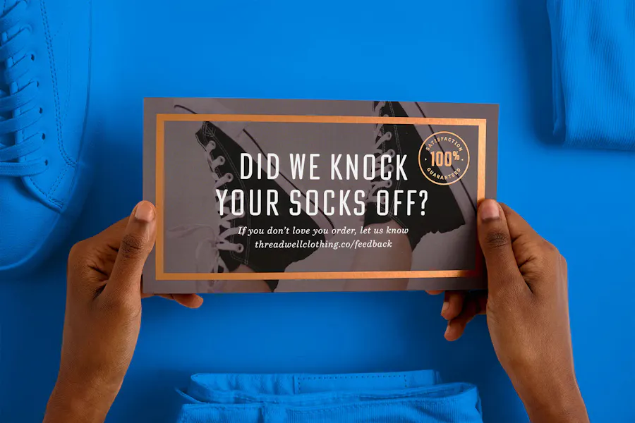
First up on our list of design trends is bold typography. Simply put, large fonts ensure your message gets seen. No matter the digital or print marketing asset, with a bold font, it’s sure to capture the attention of target audiences and beyond.
Bold typography is a cool design trend that makes an impact thanks to what it conveys. If you want your messaging to radiate strength, power and assertiveness, a distinct, bold font is the way to go. Try it on headlines, logos, promo materials, even business cards, and make a commanding impression.

2. Return of Retro ’90s Nostalgia in Modern Layouts
One of our favorite graphic design trends is the return of the ’90s. In recent years, many brands and organizations have embraced nostalgia in their layouts – and to great effect. So much of the ’90s was about contrast (think early grunge vs. late pop), and that idea blends seamlessly into current trends in graphic design.
As you experiment with retro designs, just remember they work best (and make the most impact on your audience) when blended with modern aesthetics. From expressive fonts and neon colors to collages and virtual aesthetics, a touch of the ’90s will do wonders on direct mail campaigns, packaging, even your website design.

3. Sustainable Design with Eco-Friendly
Materials & Themes
Of all the current design trends, this next one’s always a good idea no matter the year: sustainability. Focus on sustainability and your brand stands out in all the right ways. And while you can write social posts and press releases about your efforts, you can also fold sustainability into your designs with eco-friendly materials and themes.
At Smartpress, you can print everything from business signage to marketing essentials like brochures, postcards and booklets with green alternative materials and recycled paper stocks. More and more, consumers only want to do business with companies that make eco-friendly choices, and with trending designs and themes like this in your artistic arsenal, it only strengthens the trust your audience has in you and your brand.

4. Minimalism Meets Complexity in Simplified Designs
Minimalism is another one of our favorite current graphic design trends. We love how simplified designs can pair with complex elements to create impactful marketing assets that don’t overwhelm your audience.
Whether you’re designing in print or digital mediums, your message needs to be communicated clearly through visuals, and that’s where minimalism really lives up to its name as one of the best graphic design ideas. Your clients are bombarded by content all day long, and a clean design is the ultimate contrast.
But a clean design doesn’t mean a boring one. When you add subtle details like foil accents or a protective high gloss UV coating, your simple design simply shines. From booklet covers to thank you cards, bookmarks to business cards, less truly is more.
See the power of foil printing: How Foil Book Covers Put Specialty into Your Strategy.

5. Vibrant Color Palettes & Gradient Blends
Another stand-out graphic design trend is vibrant color and gradient blends. Whether you’re incorporating a popular design tactic or creating something totally unique to you, color plays a huge role in the psychology and behavior of consumers, so it’s crucial to choose your palette wisely. Your words send a message, and when you pair them with the right colors, that message not only sinks in, but also creates action – aka sales.
So how do you narrow down your shade strategy? Think about the intent of your print or digital design, and then choose a palette that sets the tone. If you want to elicit enthusiasm and upbeat energy, add a friendly shade of orange to your outreach brochure or travel postcard. If you’re creating a sense of sincerity and trustworthiness with your clients, go with blue on your company letterhead, medical mailers or presentation folders.

6. Layering with Transparent Elements in Print Design
When we think about the best graphic designs for print, layering with transparent elements is right at the top. A technique that creates imagery and designs by stacking different elements on top of each other, layering adds all kinds of interesting depth and texture to your marketing assets – and captures the attention of your audience.
We love graphic trends like this because you get to play and experiment with so many elements to find what makes the most impact. You might try layering transparent text over a solid graphic on a business card or find that when you stack one transparent graphic over a solid one it makes your message stand out even more on a postcard. Even semi-transparent elements layered on top of busy backgrounds can make a striking visual impact.

7. Revival of Detailed Line Art in Editorial Graphics
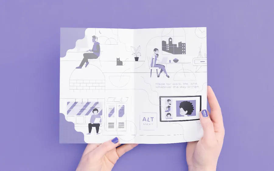
While detailed line art is one of our graphic design trends for 2024, it’s been growing in popularity for some time. A style of illustration that involves minimalist line designs and negative space, line art is so much more than drawing a bunch of straight lines on a white background.
Ideal for editorial graphics like magazines, lookbooks and online articles, today’s line art takes a more detailed approach. When you add strategic pops of color and explore zigzag and curved line types, your marketing assets radiate modern cool.
Typically depicting human figures, abstract objects or natural elements, line art can also make a sophisticated statement on labels, stickers and posters – don’t be afraid to try it on a range of marketing pieces.

8. Mixed Media Textures Across Platforms
We’ve already discussed minimalism in graphic design trends, but there’s a place and time for more, too. Mixing media is one way to do more right. After all, any elements you add should complement your design, not detract from it.
For example, you might try a raised UV coating on your business cards or the velvety-smooth Soft Touch laminate on your event invitations. Both create texture that surprises and engages customers and clients.
And while you can’t feel mixed media like this in the digital space, there’s still an opportunity to add complexity on your platforms by combining different styles, like photography and illustration or digital painting and collage.
“This is one that does a great job of highlighting one of print’s main advantages over digital,” said Smartpress Graphic Designer Jeff Barr. “A great design ideally looks good in print as well as digital but adding tangible touches like raised UV ink or gold foil is such an easy way to elevate the design in print that no screen will be able to properly emulate.”
See how we took mixed media to new heights with the Minnesota Wild’s On-the-Glass Club.

9. Custom Illustrations for Unique Brand Storytelling
It can be tempting to go all-in on popular graphic design themes, but always keep in mind one all-important metric: brand recognition. It’s why another one of our favorite trends in graphic design is custom illustrations that tell your unique brand story.
From logos to graphics to brand colors, the visuals associated with your brand speak louder than your content ever will. And those elements are everywhere (your website, products, marketing, social platforms, packaging, etc.), so the more unique they are to you, the more effective they’ll be in creating trust, loyalty and retention among your audience. (Oh, and definitely skip the stock photos!)

10. Hand-Drawn Elements in
Digital & Print Media
As our world continues to digitize, the human element has never been more important, and that’s true in everything from automations in our daily lives to recent graphic design trends. Hand-drawn elements, in particular, are a great way to reinforce authenticity in both digital and print media.
Including styles like illustrations, sketches, lettering, doodles, patterns, icons and textures, hand-drawn elements evoke emotions and tell your brand story in a way that connects with audiences on a personal level. And the math adds up: the stronger the emotion, the stronger the loyalty, the stronger the sales.
Try a hand-drawn style on nonprofit marketing, educational materials and assisted living brochures to match the emotion of the industry. As for digital media, incorporating hand-drawn elements on your website or social posts helps your audience go beyond the impersonal functionality to find the emotional side of your content.
Print Your Designs with Smartpress
From one-off direct mail campaigns to entire digital strategies, your marketing has to stand out in an ever-crowded landscape. When you combine these 10 graphic design trends with your product information, event details or service specs, your assets are sure to succeed and then some.
And while trends may come and go, great design stands the test of time. When you print with Smartpress, you have a whole team of print experts ready to help you send a branded message that not only looks professional, but also results in the ROI you expect. Explore our business and marketing essentials, and upload your design file today.