
Peach Fuzz: Designing with Pantone Color of the Year 2024
For businesses and nonprofits, the right print marketing design makes all the difference. And the aspect that makes or breaks the all-important first impression? Color. We’re focusing on Pantone Color of the Year 2024 Peach Fuzz and showing how, when designed strategically for print, it can influence your target audience and boost your bottom line.
Key Takeaways
- Peach Fuzz (PANTONE 13-1023) blends pink and orange tones to convey empathy, sophistication and community. It’s ideal for brands that want their print marketing to feel approachable yet refined.
- This color can be incorporated into designs on print pieces of all kinds, from brochures and posters to labels and event signage. It can reinforce an emotional appeal, especially in the health, wellness, lifestyle and nonprofit sectors.
- It works best in large fields (like backgrounds), as bold typography, as a support for visual elements and paired with dark tones or vibrant photography. Designers should avoid using Peach Fuzz for small text.
Print With a Color Concept
So why Peach Fuzz? According to Pantone, “our need for nurturing, empathy and compassion grows ever stronger, as does our imaginings of a more peaceful future.” Officially PANTONE 13-1023 in the Pantone Matching System®, Peach Fuzz was named Pantone Color of the Year 2024 for its ability to be “an idea as much as a feeling” that “evokes a new modernity.”
Describing it as “an appealing peach hue softly nestled between pink and orange,” Pantone believes its “velvety gentle peach tone captures an all-embracing spirit that enriches mind, body, and soul.” In other words? There’s nothing off-color about it.
At once “sensitive, sweet and airy,” Pantone also sees Peach Fuzz as “quietly sophisticated and contemporary, with depth whose gentle lightness is understated but impactful.” It’s a lot for just a color to live up to. Can it really be all that? And can it really affect your business?
Hint: When designing with color, make sure you understand which color space to work and how colors look on print vs. a digital screen before submitting your orders.
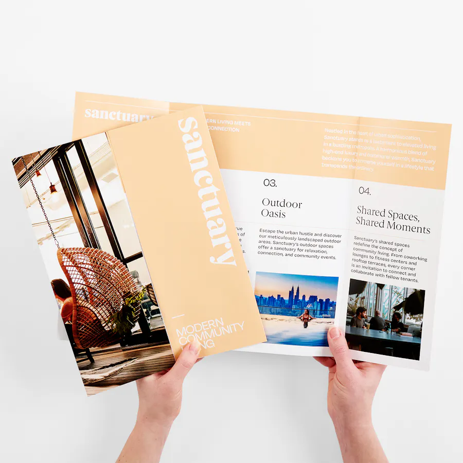
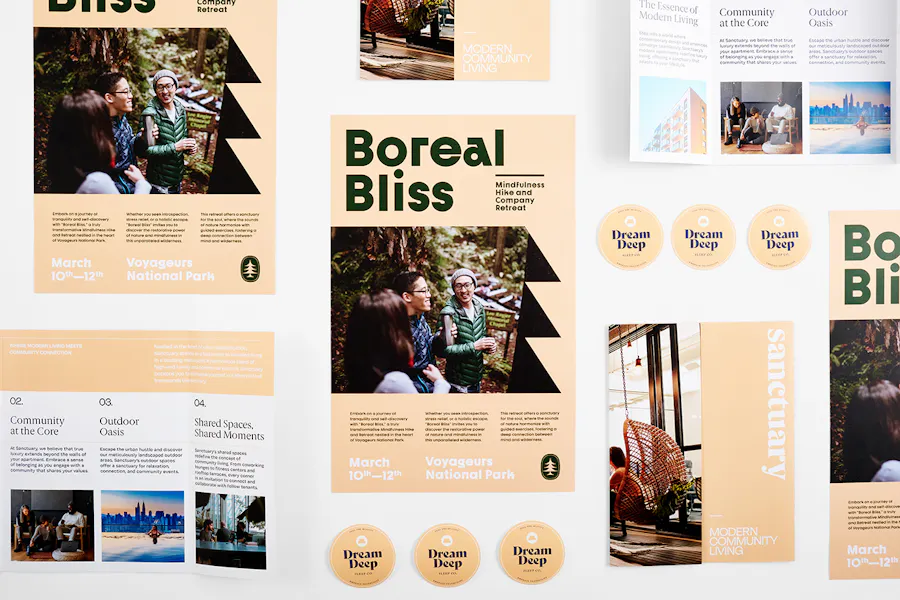
BROCHURE: 80# COATED MATTE WHITE, GATE FOLD, 17 X 11″
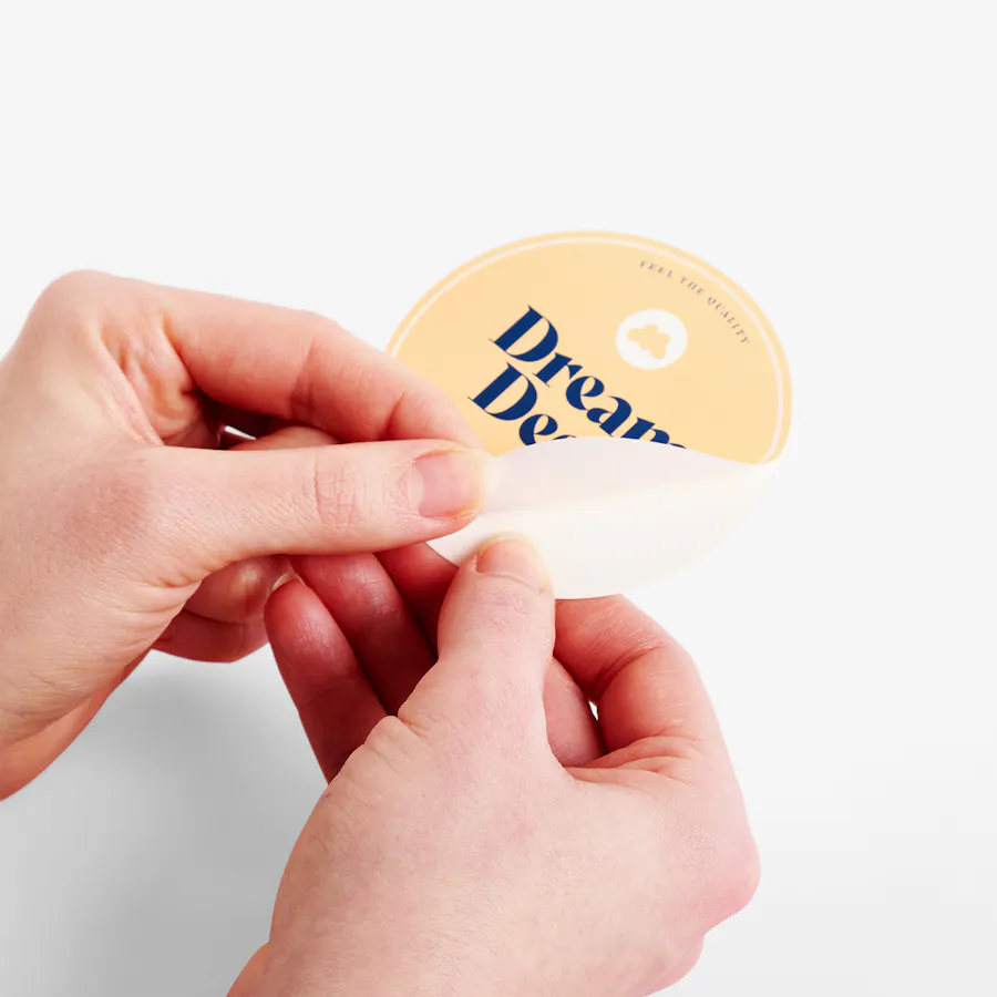
LABEL: WHITE POLYPROPYLENE – PERMANENT, CUT-TO-SIZE, 3 X 3″
Make Trending Tint Part of Your Strategy
Ask anyone in business and marketing, and they’ll tell you colors absolutely elicit certain emotions, which lead to certain behaviors. When you explore color psychology as part of your marketing strategy, it’s clear tints can turn into trends and influence how customers engage with products and companies – and Peach Fuzz is no different.
While it’s generally a good idea to stay away from trends and create branding that’s reliably recognizable, catching the trend train can be beneficial when used tactically – the potential ROI simply can’t be overlooked.
For designing print marketing with the Pantone Color of the Year 2024, this means creating inviting warmth with a human touch and contemporary ambiance. Visuals are part of the buying habits puzzle, so incorporate Peach Fuzz effectively with these ideas:
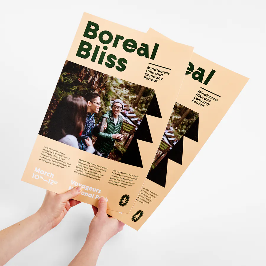
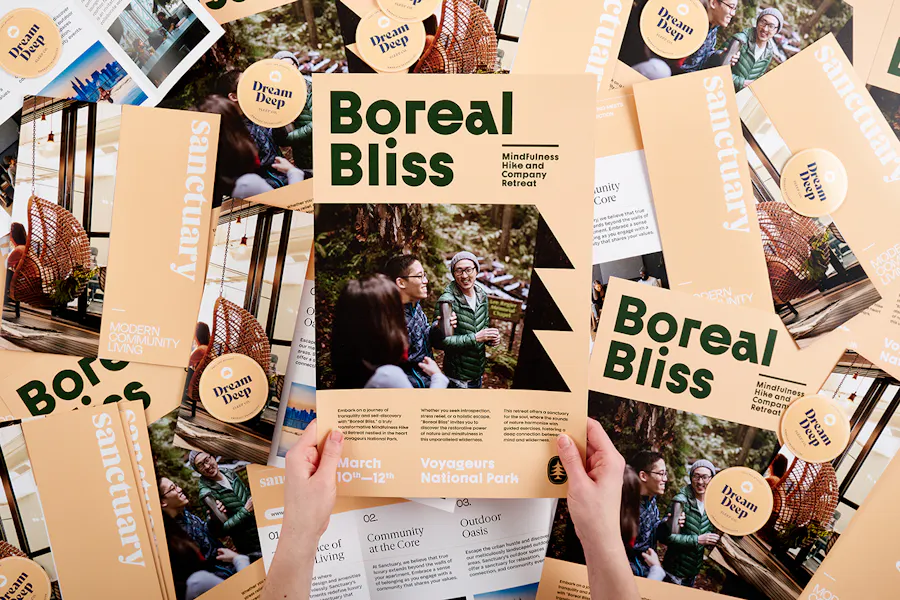
- Brochures and Flyers: Use it in the background or as an accent color to make your marketing materials visually appealing. Whether you’re printing advertising brochures or product sell sheets, the color’s warm tactility gives any message an airy, forward-thinking presence.
- Labels and Hang Tags: Product labels and tags need to attract customers and persuade them to literally lean in and get closer. Use what Pantone calls Peach Fuzz’s “fresh approach to a new softness” to embrace customers and invite them to reach out and touch your products.
“Peach Fuzz is an easy color to design with,” said Smartpress Creative Director Ferenc Andahazy. “It can be used as an orange to complement blues and greens, but it’s muted enough to pair with almost any color, like a cream or off-white. However, unlike a neutral color, Peach Fuzz isn’t as common in print collateral, so it really stands out. It’s warm, welcoming and relaxed while also feeling upscale.”
Hint: Ready to print custom labels for products, packaging and more? Take advantage of our premium business printing services and see how it’s done: Leave Your Mark: How to Print Labels for Products and Packaging.
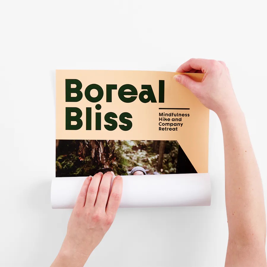
SMALL POSTER: 100# UNCOATED SMOOTH WHITE, 11 X 17″
Saturate Your Event Success
When done right, Peach Fuzz can be as soft and tender or as big and bold as you like. After all, to be Pantone Color of the Year 2024, it has to be versatile and malleable enough to convey messages that span the spectrum. And that includes event messaging.
In choosing a color for 2024, Pantone wanted a hue “whose cozy sensibility brought people together” and that “could focus on the importance of community and coming together with others.” With a pedigree like that, Peach Fuzz is prime for event marketing.
For essentials leading up to corporate functions, to setting the tone at nonprofit events and all the necessities in between, Peach Fuzz promotes the desire for togetherness and encourages attendees to savor the moment. Here’s how:
- Invitations: Use Peach Fuzz in your invitation designs to convey a warm and welcoming atmosphere. Custom printing with this shade embodies that comfortable feeling of spending time with friends, colleagues and clients.
- Event Signage: Peach Fuzz has a cozy sensibility that can bring people together, so it’s a no-brainer on signs displayed around your event. Use it to infuse your space with a welcoming ambiance.
- Posters and Banners: Here’s where Peach Fuzz can really take the spotlight in an unmissable, yet approachable way. Try it as the background color or as a dominant color to convey your message to all.
Hint: We’re an online printer for small format and large format projects alike, so there’s no event we can’t handle. From business cards to banners, postcards to posters, we do event printing right (and you can, too): Event Printing: How AUDL Scored Big with a Print Marketing Suite.
Design Tips: How to Print with Peach Fuzz
It may be the Pantone Color of the Year 2024, but like any color, if it’s used incorrectly, Peach Fuzz may leave a bad taste in your mouth marketing. We talked to design experts from our very own print shop to learn how to best leverage our commercial printing services so Peach Fuzz sends the right message in your print marketing. Here are their top five design tips:
- Typography: Use Peach Fuzz for headings. Since it’s a light, subtle color, keep headlines big and bold – skip it for small text or body copy.
- Utilize the color wheel: Peach Fuzz pairs nicely with complementing darker blues and greens.
- Pair it with high-color photography: It makes designs feel vibrant without distracting the eye or competing with imagery.
- Full flood: Try Peach Fuzz in large fields and backgrounds to add warmth to your design (used subtly, it might get lost). Unless you pair it with a high-contrast color, Peach Fuzz is best as a supporting actor, not a main character.
- Use it to make personal products and services feel luxurious: It creates a high-end vibe with content for spas, health/beauty, community living, fitness and vacation travel.
Hint: Not sure about your design? Our Layout Services team is happy to provide design help, plus work through any issues in your print-ready file so submitting your order is seamless.
The Shade of Things to Come
No matter what you’re printing, whether promotional, educational or artistic, Pantone Color of the Year 2024 Peach Fuzz has the potential to create a message that’s poetic and romantic or clean and current (or both!). Print online with Smartpress to ensure your marketing bears fruit.