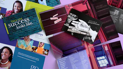
Creative Mailers: How to Stand Out with Traveling Snakes
Direct mail is trending because it works. Really well. But standing out in a mailbox is harder than ever. One way to rise above the junk? Creative mailers like our Traveling Snakes. A specialty format ideal for marketing brochures and custom invitations alike, it leads recipients on an interactive journey as each panel is revealed. Check out our chat with Foldfactory founder Trish Witkowski and get her expert design ideas, see why you should personalize print and try her hack for saving on postage.
Key Takeaways
- The Traveling Snake mailer captivates recipients with its unique unfolding sequence. It’s perfect for storytelling campaigns, promotional content and image-rich announcements.
- Custom options include variable data printing, premium paper stocks and professional coatings, so businesses can personalize each mailer to specific audiences, enhancing relevance and boosting open rates.
- For an effective design, stick to linear narratives and visuals that connect from one panel to the next. It’s important to utilize the mailing panel for branding and the USPS Informed Delivery service to reach the most people.

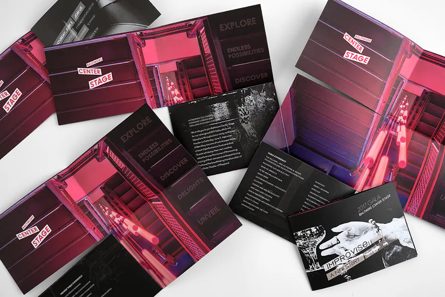
TRAVELING SNAKE: 80# UNCOATED SMOOTH WHITE COVER, 14 x 14.7
Oh, the Places You’ll Go (With Creative Mailers)
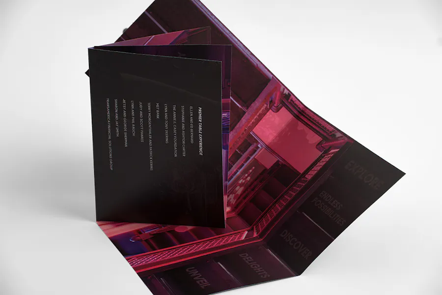
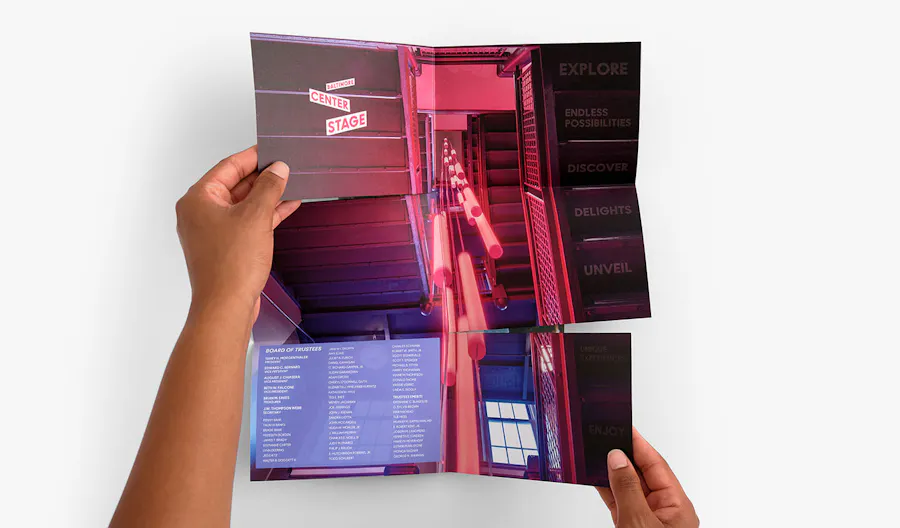
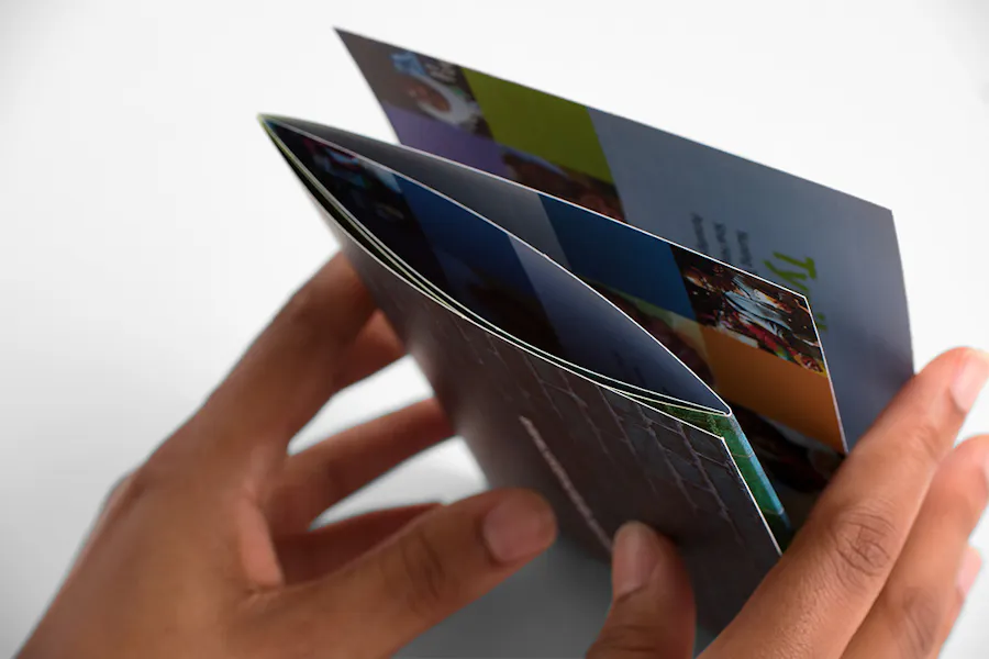
Part of our exclusive Designer Folds collection, the Traveling Snake makes your content go a long way. With six panels, it features a roll fold that coils around to reveal a large spread perfect for messaging and imagery of all kinds.
It’s a layout you’ll want to explore when designing your creative direct mail and print marketing. Why? Because the unfolding panels entice your recipients to come along for the ride. Done right, the Traveling Snake makes your target audience stick around for the story.
So what story should you tell? Any one you want! As long as your design features a through line, the Traveling Snake’s panel format speaks for itself (or rather, yourself). With this kind of folded mailer, you can’t go wrong, whether it features marketing content like progress reports, milestone timelines, nonprofit donor solicitations, service advertisements or educational information.
If you’re going the creative invites route, Traveling Snakes reveal event details and imagery for galas, fundraisers, corporate meetings and more. It’s a format that works all year round but is a particularly memorable self-mailer for end-of-year announcements and the holiday season.
Hint: Have questions about Designer Folds? As a customer-focused online printer, we’ve got answers: Designer Folds FAQ.
TRAVELING SNAKE: 100# UNCOATED SMOOTH WHITE TEXT, 14 x 14.7
Customizing Creative Mailers
Creating Traveling Snakes with a premium online printing shop like Smartpress means you don’t get just direct mail – you get custom direct mail. We’re talking paper stocks, text and cover weights, double-sided printing and protective UV coatings.
But that’s not all. We offer variable data printing to personalize each piece and our Versions feature is a must when you need multiple Traveling Snakes but with various content (more on those options later). You can even design creative mailers with our direct mail templates. Hello, convenience.
And because we’re talking about direct mail, complete mailing and addressing is part of Smartpress’ online printing services. For Traveling Snakes, we recommend either an A7 envelope or two wafer seals and no envelope at all.
Hint: Variable Data Printing: How to Personalize Your Marketing

“This format is great for content that’s heavy on imagery and light on text.”
Q&A With Trish Witkowski
As you begin to outline your custom mailers, let Witkowski’s expertise guide you from concept to campaign.
What do you like most about the Traveling Snake? What makes this fold so impactful?
Trish Witkowski: “I like the Traveling Snake for so many reasons. Its uniqueness is in the user experience and in the way it reveals the content – over, down, over, down, over. It’s both unusual and linear, which I like. There’s no doubt about how to open this specialty format or what to read next. It’s also easy to fold back up.
“From a practical standpoint, I like that it’s basically a big rectangle when laid out flat, which makes it efficient on the sheet. Plus, it’s in a mail-friendly proportion, so you can leverage what I like to call a ‘splurge/save’ scenario. Splurge on the format, save on the postage and production costs. Specialty formats do not have to be at the high end of the cost spectrum if you don’t want them to be.”
What are some ideas for how to use it? What type of content works most effectively?
“This format is great for content that’s heavy on imagery and light on text because it’s really fun and intriguing to open. So think of it like putting a clue on each panel that tempts the user to keep opening and collecting clues until they get to the answer.
“If you put a lot of text into this format, it will be hard to hold someone’s attention. They’ll want to keep moving to get to the end, so consider that as you’re planning the layout. These are great for new product announcements, event invitations, promotions, direct mail, holidays and more.”
What advice or tips do you have for designing the Traveling Snake for online printing?
“The Traveling Snake tells a story. It has a progression. The best designs I’ve seen on this format include a message that builds. One of the coolest things you can do is connect the imagery as it goes through the panels. I saw an example of a circus-themed Traveling Snake for a healthcare company and they had a tightrope design that flowed through each panel as it opened.
“I’ve also seen words that build into a statement as you open it. One other really cool thing you can do is reveal one large image as you open it. The resulting rectangular shape creates the opportunity for a poster spread reveal.”
These are self-mailers that don’t need envelopes. What are some tips or best practices for mailing these?
“For self-mailers, my biggest tip is to remember that the mailing panel can also carry artwork. This is important because there’s a program called USPS Informed Delivery. Tens of millions of Americans subscribe to it.
“They get an email each day with a scan of all of the letter-sized mail they’ll be receiving. The scan side is the address side, so consider this potential digital touchpoint as the first visual of the mailer they’re about to receive. Can you put something memorable there?”
“Remember that the mailing panel can also carry artwork.”
We’re also able to print variable data on Traveling Snakes. What are some of your favorite personalizing ideas?
“Large name personalization on the cover can be a powerful way to get someone to open the piece. Remember, they don’t know it’s a cool format until they tear those mailing tabs (or the envelope, if you choose to use one). You have to get them to want to look inside.
“I also highly recommend batch targeting with your imagery. Consider creating different versions of your mailer with imagery that serves audiences based on their similarities (age/stage in life, marital status, interests, etc.).”
When choosing a coating, how do you decide between gloss UV and matte?
“Gloss says look at me! It’s splashy, dynamic and exciting. Gloss often translates to the impression of quality. You’ll see high-end cars, real estate, bags and shoes leverage high gloss for the extra sheen and drama.
“One important note regarding high gloss is that the sheen is great for photos but not heavy text. Many find the glare can make it difficult to read smaller text on the page. Larger point sizes for headlines and callouts are generally not an issue for UV gloss.
“A matte finish offers an understated elegance that many marketers really appreciate for their brands. It’s also a show of quality but in a quieter way. Matte is often used for nonprofit, medical, legal, finance and other promotional materials.”

RECTANGULAR FOLDED CROSS: 80# COATED MATTE COVER WITH FLAT MATTE UV COATING ON BOTH SIDES, 17.9 X 12.7″
You’ve told us the Rectangular Folded Cross is a similar option to creative mailers like the Traveling Snake. Tell us about it.
“The Rectangular Folded Cross offers a similar proportion and size but an entirely different opening experience and two fewer panels. It’s great for non-linear content or people who had their heart set on a cross fold but didn’t want to incur the postage increase that comes with sending square mail.
“It’s similar to the Traveling Snake in its uses and need for heavier imagery and lighter text. It really comes down to how you want viewers to experience the content. How will you tell your story? By peeling away layers one by one or unrolling a winding path? That’s the real question.”
What do you like most about the Rectangular Folded Cross?
“I don’t spend a dollar more than I need to on postage, so my favorite thing about it is the option to save on postage [when compared to] the classic Square Folded Cross. Sometimes you’re pushing the edge of your budget, and rather than compromising on the format, you compromise on the proportion and save on the postage. It’s a win-win.”
What’s an important design tip for the Rectangular Folded Cross?
“Cross folds are truly versatile. I’ve seen quiet ones, loud ones, shaped panels, covered in imagery, layered with die cuts that build on the panels. One thing to note is that recipients don’t always remember in what order the panels fold out, so building a design that only makes sense in a very specific order can be problematic. However, there are ways to incorporate visual cues into the design to help them put it back together again.”
FEATURED DESIGNS
Traveling Snake Design by Bill Geenen for Baltimore Center Stage
Traveling Snake Design by Michele Welsh, Verdence Capital Advisors
Rectangular Folded Cross Design by The Integrity Staffing Design Team