
T-Cross Direct Mailers: How to Engage Your Clients & Creativity
With brochures, postcards and catalogs, the direct mail field is a crowded one. You’re competing for attention, engagement and mailbox real estate. For direct mailers that stay ahead of the pack, look no further than a T-cross mailer. We’ve got two variations that Foldfactory founder Trish Witkowski says offer marketing opportunities aplenty and add value to every advertisement.
Key Takeaways
- T-cross mailers break away from traditional brochure designs with their asymmetrical fold and interactive T-shape. Available in small and large sizes, they’re perfect for anything from product launches to invites.
- The small size is recommended for promotions, events, announcements, holidays and any message that doesn’t have a lot of text. The large size offers more adaptability, whether for product promos, higher education, self-promotion or conference and event programs.
- Be sure to design yours with the fold experience in mind (a mockup is helpful to see how your content flows), and a mailing panel with the correct orientation and placement is crucial for stress-free mailing.

Small T-Cross Mailer: 80# Coated Matte White Cover, 11.9 x 8.5″
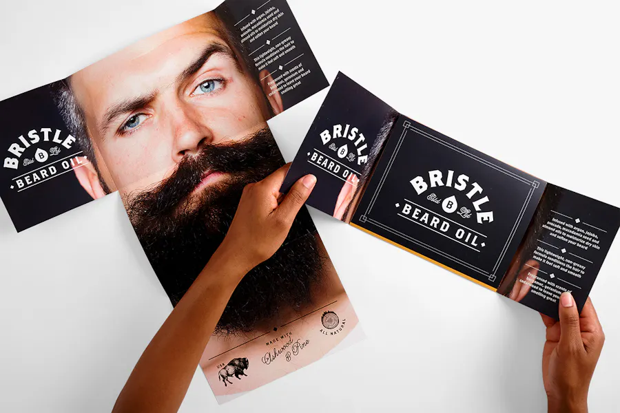
Large T-Cross Mailer: 80# Coated Matte White Cover, 17.125 x 17.875″
A Designer’s Direct Mail Cup of T
Part of our exclusive Designer Folds collection, the Small T-Cross Mailer and Large T-Cross Mailer shake up your print marketing routine. While a tri-fold is a classic, it can also be overlooked. Taking a chance on creative mailers gives your branding and your business a spark that attracts newcomers and reinvigorates established clients. And with our custom printing options, these specialty formats more than pay off.
Whether you’re designing your T-cross direct mailers for product promos, as event invites, launch announcements or informative brochures, they both let you explore the right look and feel with coated and uncoated paper stocks, text and cover weights, along with ultra gloss UV or flat matte finishes and wafer seals (or tabs) for extra security.
Our online print shop also lets you get specific and tailor your direct mail marketing campaigns to target audiences and individuals (‘cuz why wouldn’t you?) with variable data printing and full mailing services. And when we say full, we mean full. We can handle everything for you, from list acquisition and processing to mailing permits and addressing.
Hint: Speaking of getting specific, here are two mailing specs you want to get right:
- Small T-Cross Mailer: The address block must be on the middle panel with two tabs (either both on the side or one on the side and one on the top).
- Large T-Cross Mailer: The address block must be on the side without the flap and parallel to the 8” dimension with two tabs or glue to secure the flap.
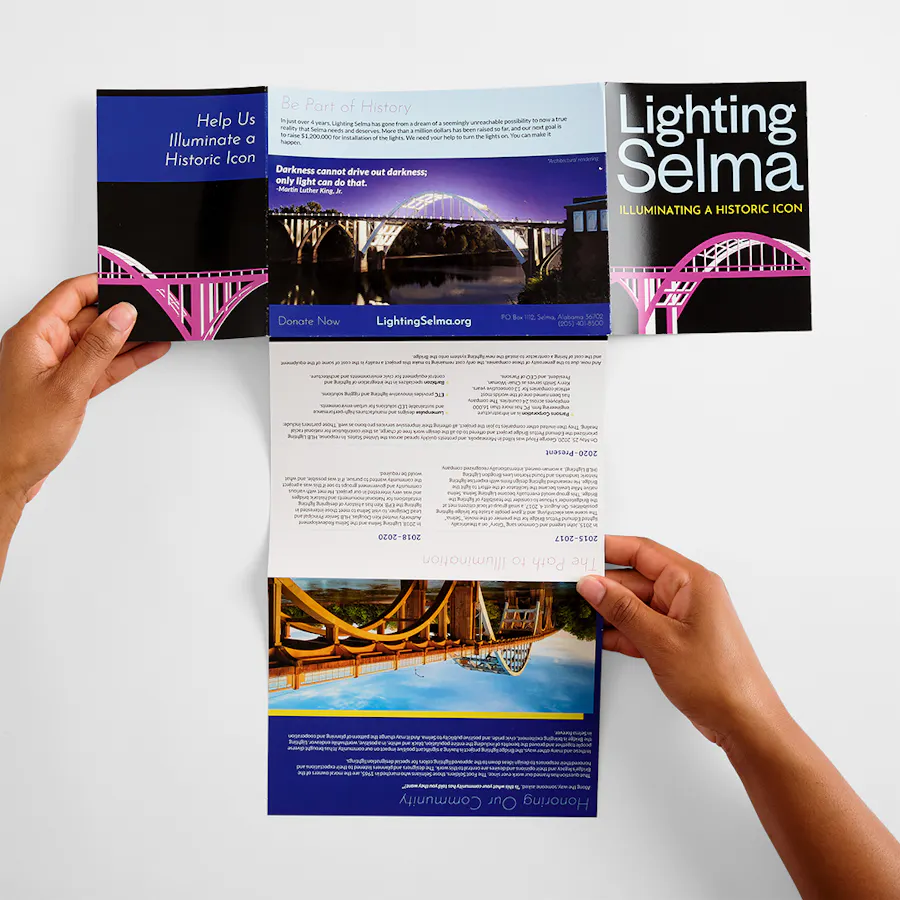
Large T-Cross Mailer: 80# Coated Matte White Cover with Ultra Gloss UV Coating on Both Sides, 17.125 x 17.875″
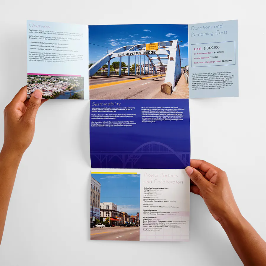
Q&A with Trish Witkowski
Before you create your direct mailers and print online, check out what Witkowski had to say about designing effective content and the importance of personalization, plus how to keep mailing super simple.
What do you love about T-Cross Mailers?
“T-crosses are cousins to the Square Folded Cross and the Rectangular Folded Cross – both great formats. What’s unique about the T-cross is its asymmetry and characteristic shape. As a designer, the format is fun to work with and not difficult to conceptualize.
“I really like the short gate panels and the reveal on the inside. I also love that both the large and small formats are designed in a rectangular proportion that won’t incur extra postage fees.”
How does size dictate the design of these mailers?
“The Small T-Cross Mailer is great for product launches and promotions, events, announcements, holidays and anything else that is text-light and impact-heavy. The Large T-Cross Mailer really has no limits. I’ve seen it used for product promotion, higher education, self-promotion, even for conference and event programs. There’s a lot of space and creative opportunity with it.”
“You get a great format that’s more exciting than a tri-fold.”
What type of content works most effectively for these advertising mailers?
“With two sizes to choose from, you have a lot of options for how you want to present your content. I’ve seen both sizes designed in a vertical and a horizontal opening direction. As long as the mailing panel is placed correctly, the direction of the rest of the art is up to you.
“If you’re working with the Small T-Cross Mailer, less is more. It forms a T-shape when opened, with short gate panels that open to the final spread. The short panels create fun opportunities for illustrations, icons, photos or a teaser quote. Use this one vertically or rotate it 90° to open out to the side.
“I’d keep the written content light, since heavy text would have to be placed in a really small font size. And what I love about it is that sometimes you have something simple to say, and if you’re working in a tri-fold, for example, you’ve got a lot of space to fill. With the Small T-Cross Mailer, you get a great format that’s more exciting than a tri-fold and has smaller panels and less area to fill. You get lots of bang in a compact size.
“If you have a moderate amount of content, jump up to the Large T-Cross Mailer. These are so fun with the extra rollout panels. I’ve seen panoramic photos on the foldout reveal, bold typographic treatments, bright color and quiet minimalism. Vertically, product benefits could cascade down the panels to reveal a special offer. Everything works on this format.”
Have you seen these custom mailers personalized with variable data?
“Oh, yes. If you’re creating something as unique and stylish as a T-cross, I’m going to make a few assumptions: You’re probably sending it to a targeted audience, and you probably know a bit about that audience. So, why not take that extra step and make it personal? Give yourself the best possible opportunity to grab attention and drive action. If you’ve never personalized your mail before, just ask your Smartpress rep for guidance.”
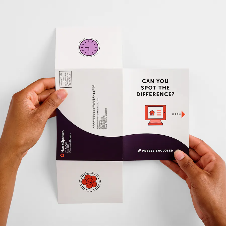
Small T-Cross Mailer: 80# Coated Matte White Cover with Flat Matte UV Coating on Both Sides, 11.9 x 8.5″
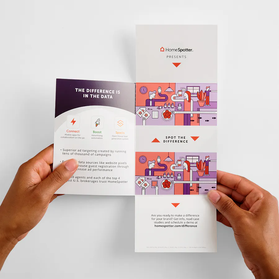
“For a unique brochure format like this, it’s all about the payoff – what’s inside? Make it worth the open.”
What advice do you have for designing print for direct mailers like this?
“When you see the template, you’ll want to just start designing because you’ll think you know what you want to do. But before you do that, print out a reduced-scale version of the mailer, cut it out and fold it down. You really need to experience the opening order to get a good feel for where your content should go and the orientation of the art. You’ll be surprised at how this will affect your layout.
(Hint: The template she mentioned? You’ll find it under Project Resources on the respective product pages.)
“As far as creativity goes, I love the two short panels to set up a powerful reveal on the interior. For a unique brochure format like this, it’s all about the payoff – what’s inside? Make it worth the open.”
What tips do you have to ensure a smooth mailing process?
“There’s really not much you can mess up on these – just make sure your mailing panel is in the correct orientation and placement, and the Smartpress team will tab it to meet USPS specifications. If you don’t feel confident about your mailing panel, ask your Smartpress rep for help.”
Hint: Can’t get enough Designer Folds? See what other formats you can fold into your strategy: Unveil the Unexpected: Marketing with Designer Folds, Open for Business: Circle Locked Gate Fold Brochures, Invites & Cards, Mailing Sleeves: A Payoff Worth the Pull.
Smartpress Offers Print Marketing to a T
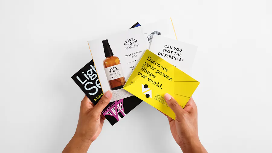
Direct mail is a traditional channel, but with creative formats like the T-cross, you get to put a modern twist on it. One that’s interactive, memorable and expands your reach. With your branding and Smartpress’ business printing services, you can close the gap between you and your clients (and widen the one between you and your competitors). The ROI practically ROIs itself.
FEATURED DESIGNS
HomeSpotter Small T-Cross Mailer Illustrations by Schmidt Design Co., Layout Design by Carl Wait
Lighting Selma Large T-Cross Mailer Designed for print by Dana Ferrill – The Modern Brand Co., LLC