
Kraft Paper: How to Design with Unique Color & Texture
When choosing a paper stock, it’s important to consider the material’s intrinsic features. What’s it made of? Is it eco-friendly? But for true impact, you’ve got to consider the aesthetics and tactility, too. How does it look? How does it feel? With sustainable specs and a unique color and texture, Kraft paper packs a one-two punch. Learn how to design print with it (and why designers love it).
Key Takeaways
- Made from 100% recycled material and processed chlorine-free using green hydropower, Kraft paper is an eco-friendly option with a natural, textured appearance that’s visually compelling.
- White ink printing on Kraft paper adds contrast and depth, especially when used as a base layer under full-color designs.
- Kraft’s earthy color and texture make it effective with minimal color use, like black, white or both. This reduces the need for complex designs while still ensuring high visual interest and strong brand identity.
Give Your Marketing Crafty Character
So let’s start with the fundamentals. Part of our ever-growing list of eco-friendly online printing services and recycled paper stocks, Kraft paper flaunts an enviable 100% recycled makeup, 30% of which comes from post-consumer waste. And to top it all off, Kraft is made with 100% green hydropower and processed chlorine-free. Talk about claiming your reclaimed status.
As for the look and feel, it’s just as good. You might know of Kraft paper as speckletone. Why? Because of its visible flecks and shives (small pieces of wood that have been cooked but whose fibers haven’t separated). That, along with its earthy color palette, creates a timeless look with tons of character.
Complete with a 100# cover weight that feels sturdy yet flexible, Kraft stands up to any print project, from marketing and networking materials to crafty pieces you sell online.
Hint: As a premium online printer, we know sustainable paper options are essential. See how we get them: Sustainable Paper: Why Printing with Smartpress is Eco-Friendly.


Make Your Strategy Speckled & Special
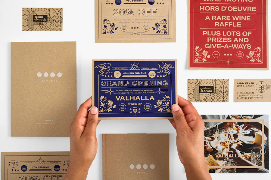
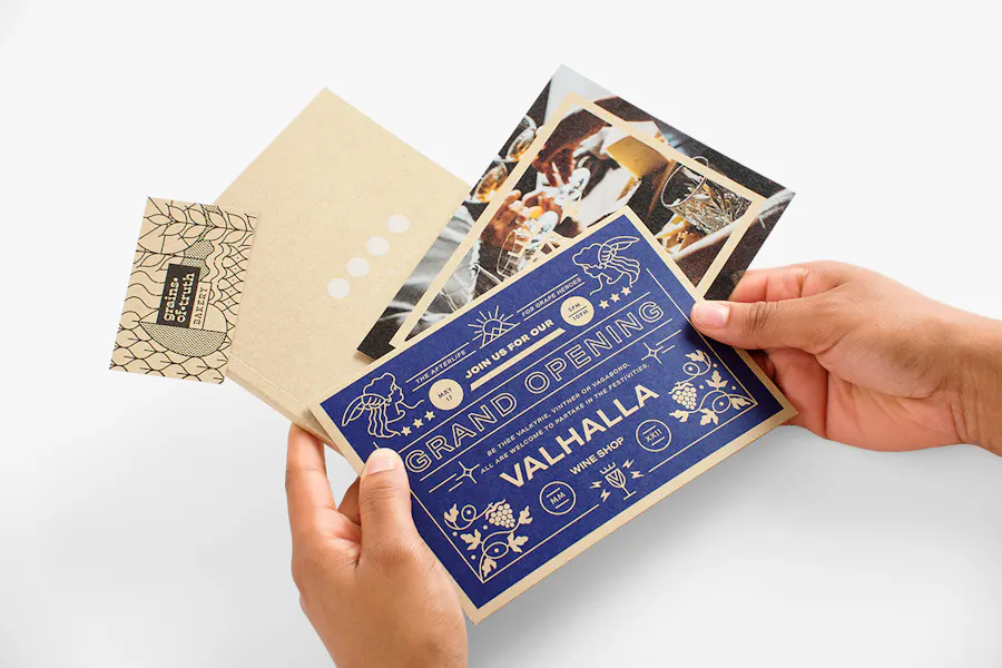
Smartpress customers love eco-friendly stocks, so Kraft paper is available on many of our small format products. What do we mean by small format? Think stationery like custom invites and event announcements, plus marketing musts like direct mail cards and envelopes. We can even do Kraft business cards and booklet covers.
And whether you are a first-time printer or long-time designer, Kraft is an equal-opportunity paper stock. Easy to work with, the Kraft paper texture allows you to add a sensory element to your project without having to add a lot of color. That texture, along with your layout and design, creates undeniable visual interest and practically guarantees engagement no matter the recipient.
Marketers love it for branding, too. Instead of adding more and more design elements to create something compelling and unusual, all you have to do is print on Kraft – the stock itself is compelling and unusual, so there’s no need to keep adding things that may end up detracting from your branding.
And finally, there’s the white ink of it all. A super versatile stock, Kraft wins big time with white ink printing, whether you use it as part of a full-color concept or as the only color to create contrast and add depth to your design.
“Kraft paper brings an immediate sense of texture, authenticity and earthiness to print collateral. Its raw, uncoated surface and natural brown tone give designs a handcrafted, eco-conscious feel that stands out from traditional glossy or white stocks,” said Smartpress Senior Graphic Designer Nate Johannes. “Because of its distinct color, it works best with high-contrast designs – think bold black ink, minimal color palettes or even white ink for a striking effect. Used well, Kraft stock can add a serious cool factor and a tactile quality that makes your piece feel both intentional and memorable.”
Hint: For the most vibrant result when printing a full-color design on Kraft paper, we recommend you add a white ink layer underneath. (See how to add white ink to your print-ready file.)
How to Design With
Kraft Paper
Before you create a project with Kraft paper and upload it for online printing with Smartpress, check out our expert tips to ensure your design doesn’t fall flat.
- Kraft exudes a handcrafted, sustainable vibe. We recommend using it for projects where you want to convey a message pertaining to craftsmanship or eco-friendly products and services. (Print Pro Tip: Let everyone know your project was created sustainably with our carbon neutral printing logo. Download it for free here.)
- Design in black-only or white-only (or black and white together) to get something really unique and minimalist. Kraft’s natural appearance and texture makes it visually arresting by itself, so it functions really well with a bare-bones color palette.
- Experiment with white ink – it opens up a world of possibilities! Since it’s commonly used for illustrations or typography, try switching it up and using white ink as a base (flood your design with white and print color on top of it). This gives you the best of both worlds: the raw material of Kraft stock juxtaposed with full color. These two elements are super appealing when paired with each other – the contrast creates a captivating overall effect.
Hint: New to graphic design? As a full-service online printing shop, we’ve got two great options for you: Graphic Design Tips for Beginners and a whole Layout Services team ready to help you design anything and everything.