Designing for Print: It’s Different from Digital
Designing for print isn’t the same as designing for digital. Whether you’re designing print marketing or branded collateral, you need to know what design elements work for one medium versus the other.
To streamline your print assets through the production process – and then boost your ROI by looking perfectly professional – we’re revealing seven essential tips for how to design for print.
Explore Smartpress’ print products for marketing, business and more.
Key Takeaways
- How designing for print differs from designing for digital: It’s all about the medium and how your assets are delivered.
- 7 tips for designing print, from color space, image resolution and fonts to paper stocks, finishes, file formats and proofing.
- How to print online with Smartpress: Simply make your print selections and upload your design file.
Print Design vs. Digital Design
If you learn only one thing from this article, it’s that designing for print is different than designing for digital. And whether you’re custom printing marketing assets or commercial printing branded collateral, it’s crucial to keep those differences in mind if you want your process to be efficient and pieces to be effective.
Just imagine: Your clients see a promo on a direct mailer or event details on a banner but the images are low-quality, the font is unreadable and the graphics are cut off. A) It’s not a good look. B) People will miss the message. And C) They’ll equate the quality of your assets with the quality of your business. Ouch.
7 Tips for Designing for Print
Before you dive into your next campaign, take a look at these seven print design tips to ensure you’re on the right (and ROI-boosting) track. From color and image resolution to fonts, finishes and formats, these tips make it easy for you to create promos that pop, ads that attract and signage that succeeds.

#1 Use the Correct Color Space
One of the print design basics you simply have to know is color space. For print, you’ll be designing in CMYK (cyan, magenta, yellow and black). For digital, it’s RGB (red, green and blue). Why is this important? Because printers display colors one way and digital screens display them another – the color spaces are designed specifically for their respective formats.
If your design includes specific colors that need to be produced precisely (like your brand colors), use Pantone spot colors that are named by a number, and we’ll color-match them as closely as possible.

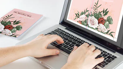
#2 Include High-Resolution Images
When designing for print, your images need to have a high resolution – there’s no getting around it. To be considered a high-quality, high-resolution image, it needs to be at least 300 DPI. With 300 or more dots per inch, your images will look sharp (not fuzzy!) when printed.
Smartpress recommends your images be in the vector format because the points and lines that make up the graphic elements remain smooth no matter how large or small the image is scaled.
Get more graphic design tips for print with the seven principles of design.

#3 Legible Fonts Only
Another one of our favorite graphic design basics is about fonts. Specifically, font size. For this, we recommend taking a Goldilocks approach: not too big, not too small. Our just-right size recommendation? At least 6 pt. for a readable, get-your-message-across-able design.
“Legibility is key when choosing fonts for print. With so many trendy or decorative fonts available, it’s easy to get caught up in style, but if the message isn’t easy to read, it won’t land,” said Smartpress Graphic Designer Nate Johannes. “Whether you go with a sans-serif, serif, script or a hybrid typeface, make sure every letterform is easily recognizable and readable at the intended size. Good typography should support your message, not compete with it.”
Use vector-based text so it’s clear at any size, and we don’t recommend flattening your text into a raster format – you’ll lose editability and quality.

#4 Be Choosy with Your Paper Stock
You can’t print without paper, but how do you choose the right one? First, consider your design intent. How are your clients receiving it? What are they supposed to do with it?
If you’re printing direct mail postcards, you might want a coated paper stock with a heavier weight so it stands up to the mailing process. If you’re designing a branded notebook for employees, you’ll want interior pages that are uncoated (or even recycled).
See and feel our selection of stocks, weights and finishes with a FREE Paper Sample Book.

#5 Add Striking Finishes
While you can add dazzling effects to digital designs, there’s nothing like seeing them IRL. Smartpress’ custom printing services include specialty finishes like a high-gloss UV coating, the tactile and velvety Soft Touch laminate and foil printing in five different colors. And they’re all the more eye-catching (and engaging) when clients hold them in their hands.
(BTW, that UV coating is just as protective as it is polished. We’re all about style and substance.)

#6 Create Your File in the Correct Format
When you’re creating print marketing with an online printer like Smarptress, you’re also creating a print-ready file. Also known as a design file, this PDF is what our experts follow when they’re printing your projects. See below for a few elements of your file that you’ll need to account for, then watch how to save your file as a PDF.
Bleed, Safety Margin & Cutting Tolerance
Before you upload your print-ready file to Smartpress, you’ll want to make sure it includes the following elements in order for us to print your project quickly and correctly:
- Bleed: Bleed is the area of your design that extends beyond the trim line (the actual finished size of your design). Your artwork must have a minimum bleed of 0.125” or 1/8”. For large format projects, like signage, include a 0.25” or 1/4” bleed.
- Safety Margin: This is the area that you want to keep all of your essential text and graphics within. It should be a minimum of 0.25” or 1/4” away from the trim line to prevent anything from getting cut off.
- Cutting Tolerance: This is the slight variation that can occur due to shifting of printing presses when your project is trimmed to its finished size. This variation can be within 1/16”, so we recommend adding a 1/8” border to prevent this.

#7 Proof, Proof & Proof Some More
Our last tip for designing for print is to proof your design slowly and meticulously. Online printing with Smartpress means you can choose what type of proof you’d like to receive and approve it before we do our thing.
If you’d like to see your colors and image resolution in person, we recommend ordering our Print & Coating Sample Sheet. It’s a great option when you’re testing out stocks and coatings, too.
It’s also a great idea to print out mockups of projects with multiple or complicated folds, like any of our brochures or Designer Folds, to make sure your content lines up and is arranged correctly.
One other option is to print a small quantity of your project first to verify everything looks A-OK before placing a large-quantity order. (That’s a little trick to our business printing services we know you’ll love!)
Print Your Next Asset with Smartpress
Now that you know how to design for print, the next step is to do it with Smartpress’ online print shop. From marketing essentials and business stationery to event signage and office decor, we’re the commercial printer that helps you get it done (and done right).
Upload your print-ready file or chat with our friendly experts to get started.