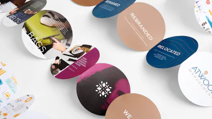
The Shape of Success: An Accordion Fold Comes Full Circle
How’s your print marketing strategy shaping up? Is it all sharp lines and rectangles? Think outside that traditional box with the Circular Accordion. An accordion fold with a round design, it gives your creative assets unexpected visual impact, whether they’re product pamphlets, service brochures or custom invitations. We chatted with Foldfactory founder Trish Witkowski about why it’ll have you running circles around your competition.
Key Takeaways
- This unique format features five round, connected panels that unfold like an accordion. It’s a striking and unexpected way to deliver messages, with a linear storytelling experience ideal for progressive content like timelines, product reveals or multi-step instructions).
- Design tips include pairing it with a custom 6” x 6” envelope, adding personalized data to elevate its impact and treating the front and back as seperate spreads to increase your brand’s creative possibilities.
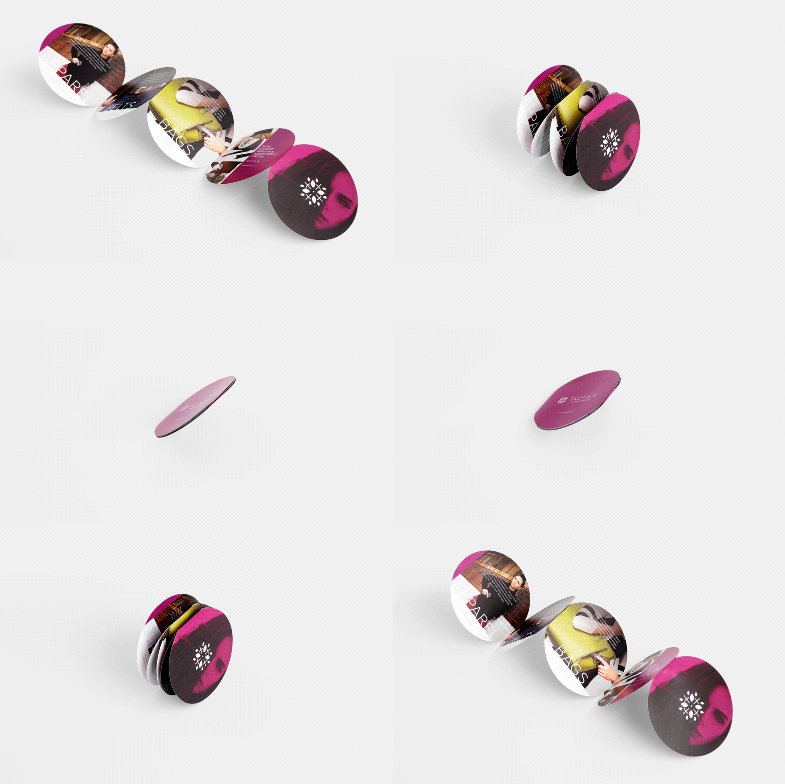
CIRCULAR ACCORDION: 80# COATED MATTE WHITE COVER WITH SOFT TOUCH LAMINATE ON BOTH SIDES, 26 X 5.5″ UNFOLDED
Circle Gets the Square on This Accordion Fold
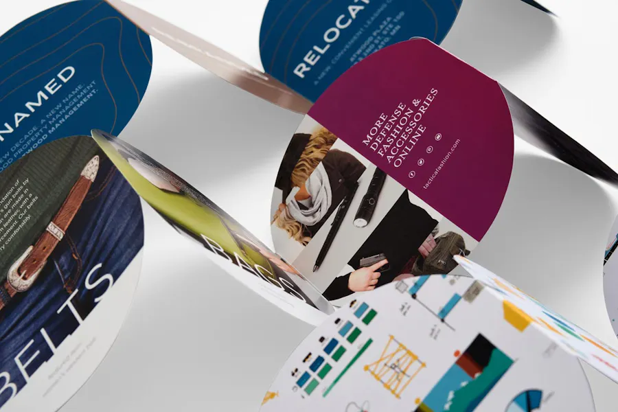
No matter how you design it, the Circular Accordion is a unique format you’ll want to focus on. A designer product from Foldfactory, this accordion fold engages and excites with a zigzag accordion fold of five connected circles. Ideal for product promos, invitation printing, even personalized holiday cards, you can customize yours with double-sided printing to double your real estate.
So what do you put on all these circular panels? With black and full-color printing options, you get to play with imagery and content that suits your situation:
- Reveal a different product or service on each panel.
- Design a renovation timeline that spans both sides.
- Show progress toward your business metric goals.
- Display how-to info with one step on each panel.
- Provide event details and imagery.
Part of our exclusive Designer Folds collection, Circular Accordions can be customized any which way you like, from paper stocks and weights to UV coatings and variable data. Whatever your marketing or invitation needs, it’s a fold you’ll want to have around.
Hint: Want another accordion fold? As a full-service online printing shop, we’ve got a different version for you right here: Multipurpose Marketing: Do It All with an Accordion Fold Brochure.
Q&A With Trish Witkowski
Ready to design your own Circular Accordion? Before you choose your artwork, write your copy and lay it all out, check out our conversation with Trish Witkowski. As the founder of Foldfactory, Witkowski’s got all the tips and tricks for an accordion fold, from design ideas to mailing – she even offers a corresponding product you just have to fold into your next campaign.
What do you like most about the Circular Accordion? What makes it so noteworthy?
Trish Witkowski: “Almost everything we design in ‘flat page’ finishes into a square or rectangular shape. So the most refreshing thing about the Circular Accordion is that the panels are round, forming a perfect circle when closed and a five-link chain when open. You can design each panel individually or make a spread that visually connects the panels together. I also really like that the panel configuration is linear despite being a uniquely-shaped format, so it’s easy to visualize and design for.”
Do you have ideas for how to use it and what type of content works best?
“This is a great format for marketing collateral. I’ve seen these work fabulously well for product announcements and as exciting add-ons to marketing kits. Circular Accordions make beautiful event invitations and holiday cards because circles are happy and light – the curves work well with logos, imagery and typography. The format makes a great impression, and with five panels, there’s a lot of area to design on.”
“Circles are happy and light – the curves work well with logos, imagery and typography.”
What is it about the circular shape that gets people excited?
“A circular brochure is a total surprise. You really have to open it to see what’s inside. Once you do, you realize it’s an accordion, and who doesn’t love an accordion fold? Subliminally, I think it feels a bit nostalgic, like when you were a child folding down a sheet of paper and cutting paper dolls or snowflakes, then opening it up to reveal the shape you made. There’s a sense of surprise in the perimeter shape and reveal.”
As a premium online printer, we offer two types of coatings for this designer fold. What do you think: to coat or not to coat?
“Ah, the eternal question. The good news is, you can’t go wrong with either scenario. UV coatings are great for protection, but if you’re delivering the piece in an envelope, protection won’t be an issue. UV coatings are also great for an edge-to-edge high gloss finish, which can add drama and also a bit of thickness to the sheet.
“So, if you’re on the fence, ask yourself what will be achieved if you use it (perceived value, quality, sensory enhancement). If these goals are in line with what you want to achieve, go for it!”
You mentioned mailing Circular Accordions. What envelope size works best?
“The Circular Accordion fits perfectly into a 6” x 6” square envelope. Consider a colored envelope for added impact.”
Hint: Circular Accordions must be in envelopes if they’re to be mailed. Get the perfect 6” x 6” size via Custom Quote.
We offer one of the most convenient online printing services with Circular Accordions: variable data printing. How would you recommend someone use it?
“Since this format is digitally printed, you can personalize the message, name and imagery to make it truly relevant to the recipient. It’s a powerful and cost-effective way to add engagement.”
Hint: Need more variable data ideas? We’ve got you covered: Variable Data Printing: How to Personalize Your Marketing
What advice do you have for marketers, small business owners and creatives about designing the Circular Accordion for online printing?
“One of the benefits of this format is that the front and the back sides are entirely different spreads. No art from side one crosses onto side two, so you can see the entire spread while you’re designing, which is an advantage. The panels are also viewed in sequence, so you can place messages that build on each other from left to right and it will likely be read in the appropriate order.”
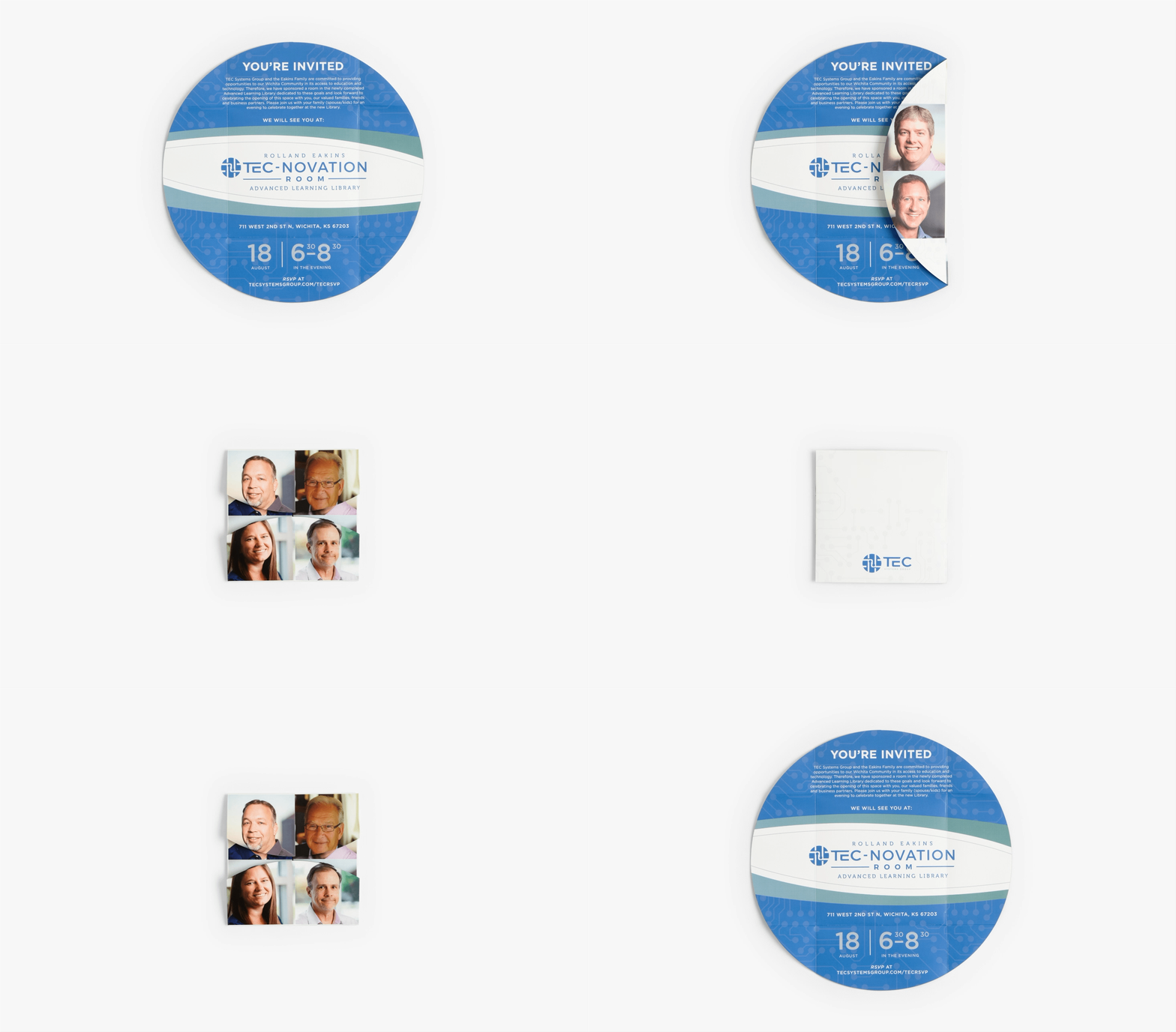
If someone likes the look of the Circular Accordion, they’ll love the Two-Way Circular Gate! Why is that a good optional product to consider?
“If you’re thinking about a circular shape as a design element, then it’s a good idea to explore other circle-based formats like this one. Consider what you could do with one large circle, rather than five small ones. The Two-Way Circular Gate can hold light materials inside, which may tip the scales toward this format if you need more real estate or the option of an insert.
“On the flipside, if both the Circular Accordion and the Two-Way Circular Gate offer too much real estate, consider the Circle Locked Gate as a compact, circle-themed alternative.”
What do you like most about the Two-Way Circular Gate? Any design tips for it?
“What I love about the Two-Way Circular Gate is that it’s a square that becomes a circle. That’s totally unexpected and it can be dressed up and down. I’ve seen it with elegant patterns and sophisticated typography. I’ve also seen it designed as a huge golf ball, wrapping an invitation to a charity golf tournament.
“There’s a lot you can do with it but it’s not as linear as the Circular Accordion. The short, curved panels are decorative and they don’t hold a lot of type. Your message really needs to be on the interior spread or insert, whereas the Circular Accordion can leverage every panel to build on a message.”
Hint: Consider adding a Postcard or Business Card as an insert for your Two-Way Circular Gate. Or take it up a notch by inserting a custom Die-Cut Magnet!
FEATURED DESIGNS
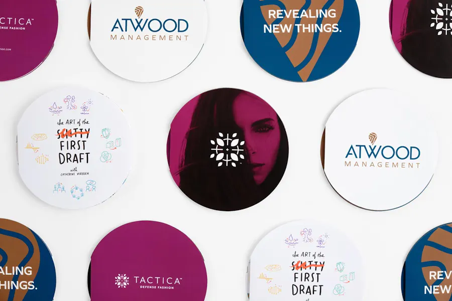
Atwood Living Circle Accordion Design by PresenceMaker for Atwood Management
First Draft Circle Accordion Design by Catherine Madden
Tactica Circlular Accordion Design by Kiel West, Tactica Defense Fashion
Two-Way Circular Gate Design by Cassandra Bryan Design LLC