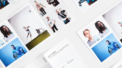
Tri-Fold with a Twist: The Bold & Dramatic Broadside Reveal Brochure
A brochure is a brochure is a brochure, right? No way! Check out the Broadside Reveal Brochure. With a classic tri-fold format, an unusual broadside folding and a surprising horizontal reveal, this designer fold makes its own marketing rules. Foldfactory founder Trish Witkowski tells us all about this creative mailer, how to choose the right imagery and why using variable data makes the ultimate statement.
Key Takeaways
- The Broadside Reveal Brochure reinvents the traditional tri-fold with an unconventional horizontal reveal, offering a dramatic visual payoff. It unfolds to a poster-like display, making it ideal for events, promotions, self-promotion or maps.
- This format thrives on strong visuals to create immediate engagement. It’s recommended to use bold imagery and infographics, along with variable data printing to personalize content, colors and images.
Broadside Reveal Brochure: 80# Coated Matte White Text, 14.5″ x 12.4″
Marketing Brochures are Open for Business
Coming up with creative brochure ideas can be challenging, especially when you need print marketing to make an impact. (That’s the whole point, right?) But when you create custom mailers – and other collateral – with the Broadside Reveal, you’re guaranteed to leave an impression that converts customers, amplifies awareness and reaches new audiences.
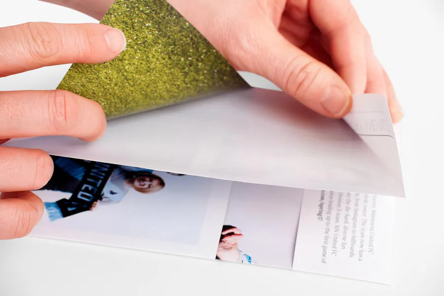
The broadside folding is truly the money maker on this one. Part of our specialty Designer Folds collection, it hints at what’s beneath the fold before opening up to unveil the large imagery and engaging content you designed for that very moment.
With online printing options like coated and uncoated paper stocks, full-color printing, text weights and matching envelopes, the Broadside Reveal is ideal for so many marketing situations. Think event announcements, product and service advertisements, special promotions, event maps, newsletters, trade show schedules, photography portfolios and more.
Hint: Wondering why Designer Folds get all the advertising action? As a full-service online printing shop, we’ve laid it our for you: Unveil the Unexpected: Marketing with Designer Folds.
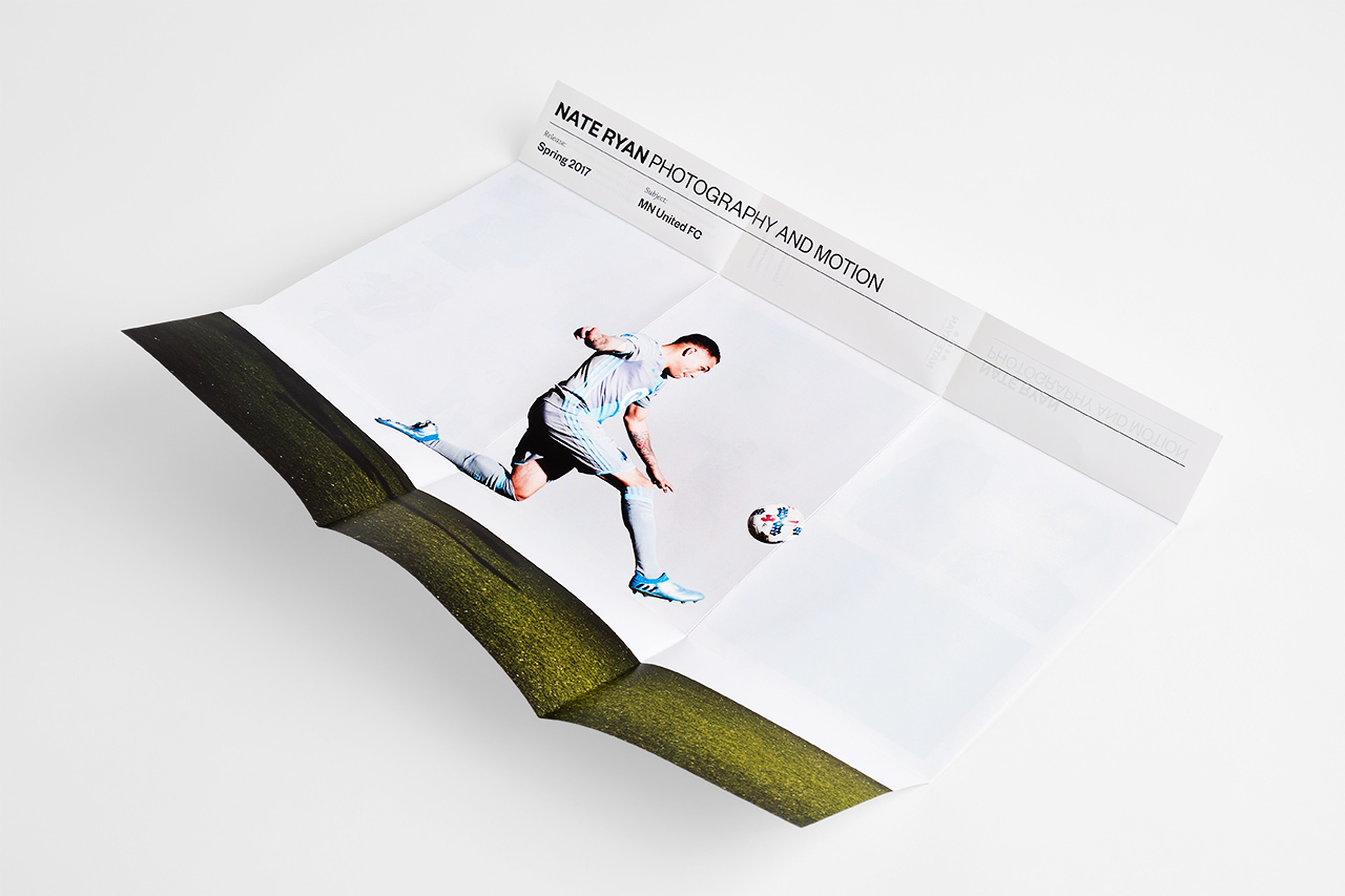
Broadside Reveal Brochure: 80# Coated Matte White Text, 14.5″ x 12.4″
Q&A With Trish Witkowski
Ready to design marketing brochures unlike any others? As the founder of Foldfactory, Trish Witkowski has all the tips and tricks to help you do it. Check out our conversation with her and then print yours for advertising, invitations and more.
“If you have great imagery to work with, it’s going to sing in this format.”
What makes the Broadside Reveal so impactful?
Trish Witkowski: “The Broadside Reveal is especially impactful because it offers a tease of imagery that invites you to open up to a larger, poster-like reveal on the outside of the brochure. From the recipient’s perspective, the narrow strip of imagery is intriguing, and from the designer’s perspective, it’s a lot of fun to design. It’s like a tri-fold with a twist.”
What advice or tips do you have for designing print for the Broadside Reveal?
“One of my favorite uses of this format is for self-promotion. There’s a real luxury of space for imagery and there’s plenty of room to put information about your work, your contact information and your services on it.
“It’s also great for events and fundraisers. I’ve seen long donor lists in neat columns throughout the hidden panels. The lists don’t obstruct the view of the creative layout, but because they’re in the hidden area, the recipient feels compelled to uncover and view the content. The names are hidden at first and then become a focal point.
“I love this format for maps of all kinds. The sneak peek of map topography across the narrow strip is refreshing and opens to reveal a poster-sized map, while the interior of the brochure can feature places to visit, highlights and history.”
What are your recommendations for how to feature photography versus infographics?
“This is an interesting question. Our brains process imagery so fast, and if you have great imagery to work with, it’s going to sing in this format. The great thing about infographics is that they’re interesting, bold and can make just about any dry report into something people can process.
“The Broadside Reveal absolutely cries for visual drama, whether that’s through photography, illustration, texture, infographics or even bold typography that peeks through the tease area. In my opinion, you can’t lose with either choice.”
Hint: Need help with your layout? Reference this handy Layout Guide (and find more here) or chat with our expert Layout Services team. As a customer-focused online printer, we’re here for you!
What are ways to use variable data printing on the Broadside Reveal?
“I would challenge you to think outside the average brochure design for this one when considering variable data. Personalize the brochure with the recipient’s name in a powerful message or question on the cover and change the colors and imagery to suit the recipient’s tastes and shopping preferences. It would also be really cool to use custom imagery or messaging in the reveal area – a personalized quote or image that distinctly relates to them.”
Hint: Broadside Reveals must be mailed in envelopes. Did you know addressing is part of our online printing services, too? Use the dropdowns on the product page to choose both your envelope and envelope printing options and let us do the addressing for you.
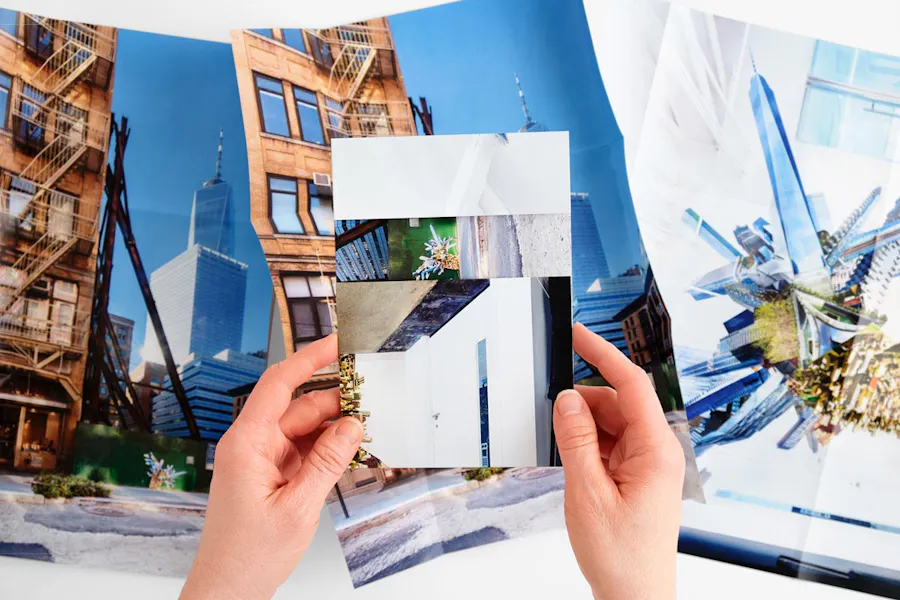
Broadside Reveal Brochure: 80# Coated Matte White Text, 14.5″ x 12.4″
What else is important to share about this product?
“Many of our Designer Folds use a metal die but this particular format uses a series of creatively placed scores, which means you could play with the size and placement of the horizontal strip – center it, make it lower, thicker, etc. You could also add a panel to make it a Broadside Closed Gate or Roll Fold Reveal.
“If you do plan to make adjustments, contact the Smartpress Layout Services team to be sure that you stay within the tolerances of the folding machine and avoid any errors or production delays.
“Just remember there has to be some sort of a payoff in the reveal – content to read, a powerful image or message or something thought-provoking. If you don’t have something really interesting to show off, you may want to consider a different Designer Fold.
“For instance, the 6-Panel Mega Brochure has its own version of a reveal but it’s more traditional in its configuration, whereas the Broadside Reveal subliminally sets an expectation that something pretty cool is hidden underneath.”
6-Panel Mega Brochure: 80# Coated Matte White Text, 28.75″ x 13.6″
How is the 6-Panel Mega Brochure a good alternative to the Broadside Reveal?
“The decision comes down to a few key things. The 6-Panel Mega Brochure is larger overall, so if you have a lot of content, it could get a little crunchy in the Broadside Reveal, especially if you’re saving the reveal side for something visual and cool, and therefore pushing most of the written content to the interior.
“If you’re mailing, the Broadside Reveal requires an envelope, whereas the 6-Panel Mega Brochure can self-mail or ride in an envelope. The two would mail in different classes, with the smaller Broadside Reveal meeting the Letter size standards and the Mega Brochure qualifying as a Flat, which means you’ll want to figure out your postage costs in advance, too.
“Both brochures have a tri-fold base, which makes them a bit familiar and intuitive but still special and fun to design. Both also avoid the use of a metal die and are machine-folded, rather than hand folded, which will have a positive effect on the production cost.”
What do you like most about the 6-Panel Mega Brochure? Any design tips?
“Oversized mail really gets attention in the mailbox and makes a powerful impact when opening. Why not increase your chances of being noticed and read by choosing an oversized format? There are four ‘views’ when opening this piece and you need to consider each one carefully: the view when folded down (front and back), the first interior cover panels, the first opening spread and the interior spread.
“Think about how you want to walk someone through the experience and design for that experience. Pull them through the design.”
FEATURED DESIGNS
Broadside Reveal Design by Daniel Lurvey | Photography: Nate Ryan
Broadside Reveal Design by Jennifer Williams | All images from the project “New York: City of Tomorrow” by Jennifer Williams
6-Panel Mega Brochure Design by Resource Furniture