
How to Make Flashcards in 7 Steps: From Concept to Print
By learning how to make flashcards, you open up a whole new world of branding, engagement and sales. They’re unexpectedly effective marketing assets!
As businesses and organizations of all kinds know, new and inventive marketing tactics are essential for staying ahead of the competition – and flashcards help you do just that. Let’s take a look at how to create and print them in just seven steps. Plus, we lay out six design tips you don’t want to miss.
Key Takeaways
- Flashcards are versatile and powerful marketing tools that can go beyond traditional learning use cases and serve as brand assets, how-to guides and product showcases.
- You can customize your desk in seven steps: choose the size, design the layout, add visual elements, explore color, organize your content, prepare your design file and select stocks and finishes.
- Tips for well-designed and effective flashcards include using typography hierarchy, adding structure and incorporating patterns or textures.
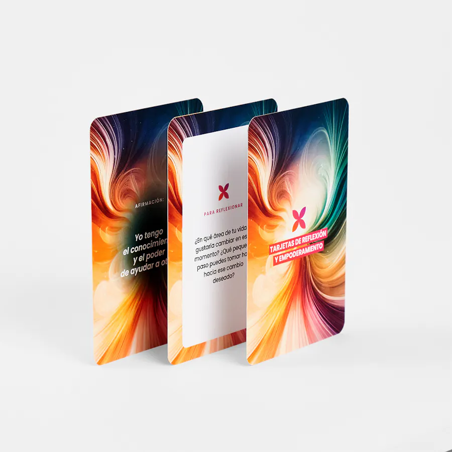
FLASHCARDS: C2S 14 PT WITH FLAT MATTE UV COATING ON BOTH SIDES AND 1/4″ ROUNDED CORNERS, 3 X 4.5″
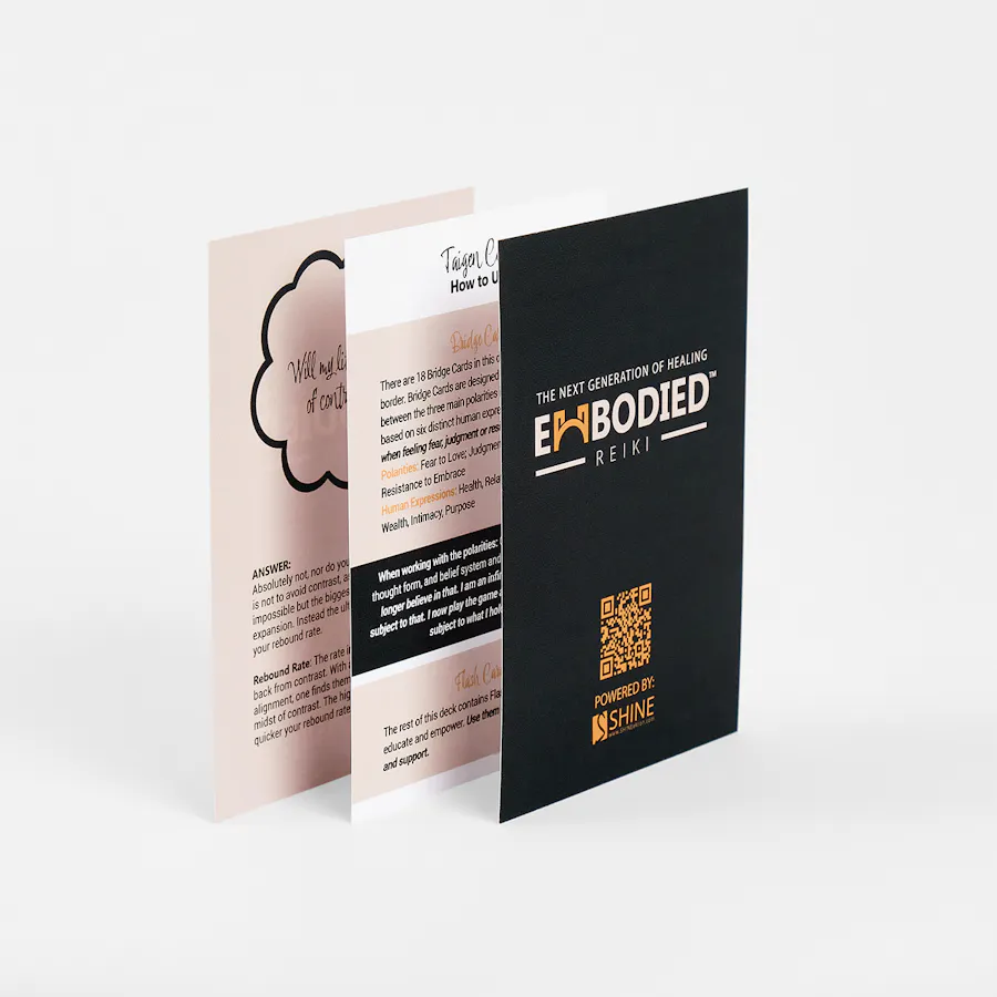
FLASHCARDS: 100# COATED GLOSS WHITE COVER, 3.5 X 5″
How to Use Flashcards for Your Business
At first thought, it may not be obvious how to use flashcards for marketing. Of course you can design printable flash cards for multiplication and languages, but in the hands of businesses and organizations, flashcards become how-to guides, they showcase your products and services, and are a blank canvas for affirmations and ideal memorization tools.
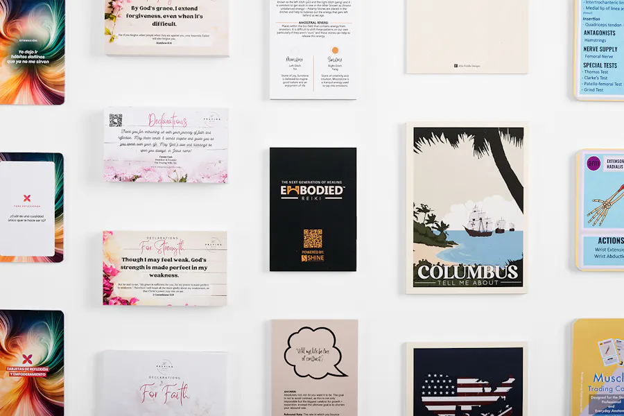
For example, Keren Devin, cofounder of Awaken Latam, designed her affirmation flashcards “to provide a simple tool for self-reflection and empowerment.” She distributed them “through our network of coaches, aspiring coaches and entrepreneurs seeking personal and professional growth.”
Shine Ohio CEO Cortney Martinelli’s flashcards “are included in the student kit for our Embodied Reiki certification [and] practitioners can use them with clients.”
Because of their handy size, they’re excellent assets for on-the-go advertising and events, too.
Step 1: Choose Your Flashcards Size
The first step in printing flashcards for your brand or business is choosing a size. How you plan to use them will determine which flashcard dimensions are best. Some common sizes you’ll come across are 3” x 5”, 4” x 6” and 5” x 7”.
For reference, standard playing cards are 2.5″ x 3.5″. When you print with Smartpress, you get to choose from more than 10 pre-set sizes, or you can use your own custom dimensions.
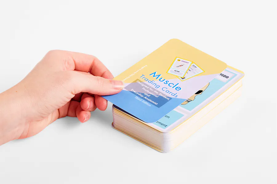
FLASHCARDS: 100# COATED MATTE WHITE COVER WITH ULTRA GLOSS UV COATING ON BOTH SIDES AND 3/8″ ROUNDED CORNERS, 3 X 5″
Step 2: Design the Layout
The next step is designing the layout for your flashcards. Just like the dimensions, your use case will determine your layout. You can use our printable flashcards template (under Print Templates on the flashcards page) or design something that’s totally unique to your brand. We recommend something like this:
- Front side: Show the product, concept, term or even a question.
- Back side: Offer product details, an explanation, how-to steps or the answer to a question.
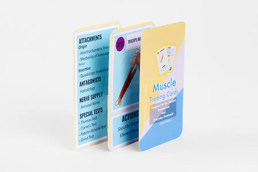
An intuitive layout was key for Dynamic RMT’s Dylan Crake, who sells her anatomy trading cards on Etsy. She set out “to make easy-to-use flashcards that were more friendly for students in a massage therapy (or related) college program.”
It’s important to take the time to consider your layout before you begin adding other design elements, but to also remain flexible as new possibilities reveal themselves as you play around with it.
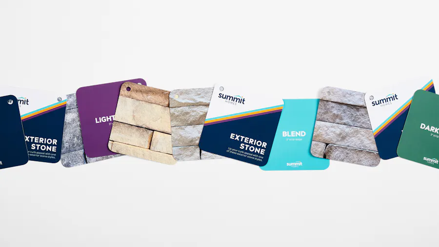
FLASHCARDS: 150# COATED MATTE WHITE COVER WITH SOFT TOUCH LAMINATE ON BOTH SIDES, 3/8″ ROUNDED CORNERS AND DRILL HOLES, 4 X 4″
Step 3: Add Visual Elements
When you think about how to make flashcards online with Smartpress, a crucial step is choosing your visual elements. From images that tell a story to branded icons, even diagrams and charts that draw clients’ eyes, visuals often speak louder than text.
For Summit Homes Marketing Manager Sam Carlson, flashcards were the answer to displaying stone samples clearly to home buyers: “We were excited about making the samples really pop! That’s why we decided to showcase a stunning, high-quality image of each stone on one side of the card.”
The images on those flashcards coordinated perfectly with paint samples, and yours can create a similar cohesion for your brand – just make sure your images are high resolution (that’s 300 DPI for print).
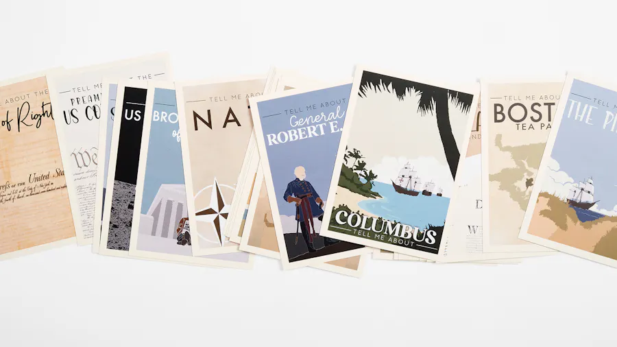
FLASHCARDS: C2S 14 PT WITH FLAT MATTE UV COATING ON BOTH SIDES, 5 X 7″
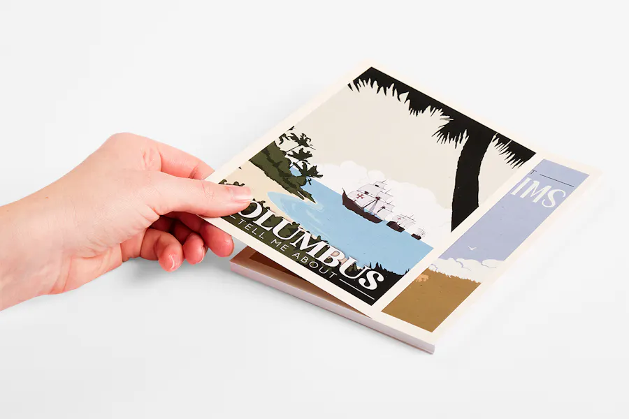
“I wanted something simple, beautiful and fun to look at.”
Step 4: Explore Color & Contrast
When you print with Smartpress, your custom flashcards are just that – totally customized. And that includes the colors you choose. For the best results (and most engagement), select a color scheme that’s easy on the eyes and enhances the readability of your content. It’s also a good idea to create contrast between your text and the background, so your words really stand out.
When Allie Riddle of Allie Riddle Designs needed some homeschooling visual aids, she created her own historical flashcards with custom colors and artwork: “I wanted something simple, beautiful and fun to look at. My initial inspiration was national park posters and travel posters. I loved the colors, abstract art and simplicity of them.”
Each of her cards features a color scheme and contrasting text that’s easy to read and still super appealing – which is exactly what you want.
Step 5: Organize Your Content
At this point in the design process, it’s time to organize your content. Pull all of your text, visual elements and color selections together, and see how it looks. You may even want to print out a mockup to get a literal feel for it in real life. Is it as visually compelling as you want it to be? Is it telling the story you need it to? Does each card in your deck convey a single idea?
When reviewing your personalized flashcards, be sure to consider:
- Is the text concise and to-the-point?
- Are your key ideas in bullet points or easy-to-read lists?
- Are there typos anywhere?
- Is any part of your design cluttered?
Step 6: Prepare Your Flashcards for Print
The penultimate step of the flashcard printing process is to create a print-ready file. Also known as a design file, this is a PDF or image file that’s suitable for printing at Smartpress. Here are a few tips for creating an error-free print-ready file:
- All of your images should be high resolution (that 300 DPI we mentioned earlier).
- Use CMYK colors for the most accurate comparison between what you see on your screen and what is produced with the press.
- Include the appropriate bleed and crop marks to ensure any variances in production don’t affect your print. For flashcards, we require a 1/8″ variance, just in case the press drifts slightly in any direction. Because of this, the finished size of your flashcards should be expanded by 1/4″.
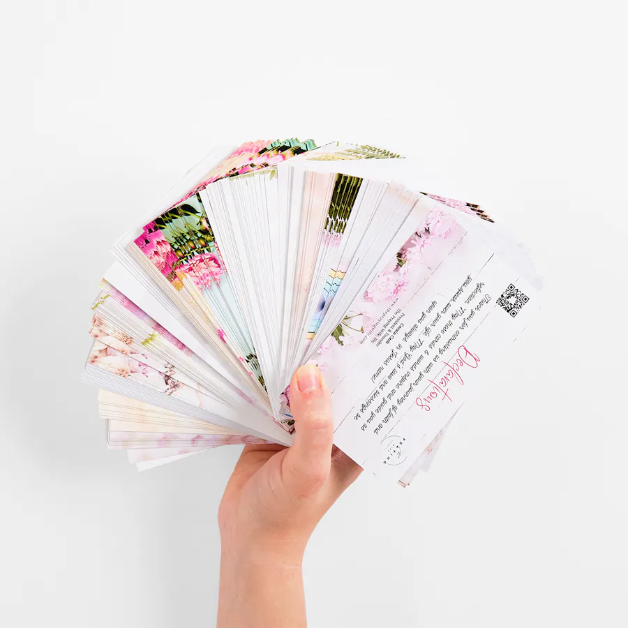
FLASHCARDS: 80# COATED GLOSS WHITE COVER, 3 X 5″
Step 7: Select Paper Stock, Coating & More
And finally, it’s time to choose paper stocks, finishes and more. When you think about how to make flashcards, these choices will once again be based on how you plan to use them. If they’ll be handled a lot, you might choose a coated stock and a thicker cover weight. You might also consider adding a protective UV coating for durability or our Soft Touch laminate for a velvety-soft finish.
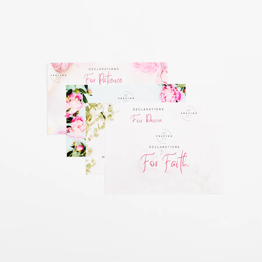
Having paper weight options for custom flashcard printing was essential for Corain Cash, founder of The Praying Wife, Inc. “Having the ability to get thinner or thicker cards was great, and I ended up ordering more in a thicker size as I tested out the durability,” she said.
Did you know flashcards are collated for print? See what else you can collate.
Design Tips for How to Make Flashcards
Even with our seven steps for how to make your own flashcards, you may still need more design tips and advice – and we’ve got them! Check out six tips from our very own Smartpress Creative team for flashcards that are practical yet polished (and get you that all-important ROI).
“[Our flashcards are] consistent with our signage, creating a cohesive and visually stunning brand representation.“
Use Typography Hierarchy
As you design your flashcards content, it’s a great idea to use typography hierarchy. This simply means to use larger font sizes for things like questions and terms relevant to your business and smaller font sizes for answers, definitions and explanations.
For larger font sizes, we recommend 18-24 pt., and for small font sizes, we recommend 12-16 pt. No matter which font size you choose, make sure it’s clear and readable.
Be Conscious of Your Color Palette
We’ve already touched on the importance of color and contrast, but your color palette as a whole is important, too. When choosing a palette, one option is to aim for an ethereal scheme paired with bright hues that pop to convey joy and energy. Then incorporate darker, muted tones to add a touch of drama and depth.
And as for the backgrounds of your custom flashcards? Consider a subtle textured background or a gradient for added depth. Just be sure your colors coordinate with your brand and your text remains legible. Follow Carlson’s lead:
“We added our vibrant new brand colors to the back of the cards and incorporated a cool line design on the front cover,” she said. “This design is consistent with our signage across the market, creating a cohesive and visually stunning brand representation.”
Add Structure to Your Card Layout
Your layout is a crucial part of how to make flashcards for your brand. We love a grid system that maintains alignment and balance as you place your elements throughout. White space is important, too. Leave an ample amount of it around text to avoid clutter and make your cards feel spacious.
Structure and balance was especially important to Cash: “I really wanted it to be a simple and elegant design with soft pastel colors to create a soothing and uplifting visual experience when reading the declarations.”
Be Deliberate with Your Visual Elements
When you print custom flashcards, you want them to truly represent your brand, so be discerning when choosing visual elements. You want icons and illustrations that are simple, relevant, complement your text and convey your message quickly.
For Devin, “The design vision focused on creating an aesthetically pleasing and engaging format that resonates with our target audience.”
Have borders and dividers? Use thin lines to separate sections, but avoid overwhelming the design. You might try rounded corners for a softer look.
Get your flashcard printing questions answered with our FAQ.
Incorporate Patterns or Textures
Patterns and textured designs are another way to make your flashcards appealing and compelling. With background patterns, lean toward subtle dots or stripes to add interest without distracting from your content. For textures, consider a light texture overlay to create a tactile feel (this is especially effective if you’re printing on cardstock).
When playing with patterns and textures, just be wary of overly complex or busy designs, as they can distract your audience and make your message less effective.
Maintain Visual Consistency
One last design tip is to be consistent with your visuals. When you create printable flashcards, stick to the style for icons, illustrations and typography across all the cards to create a cohesive set – this also helps focus your message for your audience. And be sure the alignment of your text and visual elements is the same, so the overall effect is professional and clean.
Print Your Flashcards with Smartpress
Your print marketing assets need to stand out so your brand or organization does, too. And with custom flashcards in your artistic arsenal, your promotions, declarations, products and services do just that. Any business can produce brochures and postcards, but taking a creative leap with personalized flashcards ensures your brand isn’t just any brand – it’s a memorable one.
Now that you’ve learned how to make flashcards, it’s time to print yours with Smartpress. Our experts are happy to help you do everything from choosing the right paper stock to creating your print-ready file.
“Creating your own flashcards can be intimidating, but Smartpress made it easy and affordable!” Martinelli said.
And Riddle, who sells her flashcards on Etsy, said “The customers purchasing [my] cards always comment on their high quality!”
For Crake, Smartpress was a pleasant printing surprise: “I didn’t know I could create something like this and have it come to real life! Smartpress has been the best to work with, double checking my designs for me and everything. I’m never worried about getting my box of new cards, I’m always excited.”
Give your marketing a fun twist – start designing flashcards today.