Designer Debate: Pantone Color of the Year 2026, Cloud Dancer
Cloud Dancer is Pantone Color of the Year 2026 and everyone’s talking about it. It’s subtle, it’s polarizing, it’s even provocative.
Should you incorporate it into your brand’s marketing? Is it an effective choice for any print marketing? Two of Smartpress’ graphic designers go head-to-head to debate the color. Hear whether it could be a good fit for your industry and how to use it in print designs (or if you should at all… ).
Explore all of Smartpress print products for your next campaign.
Key Takeaways
- Cloud Dancer is versatile, but context matters. It can act as a subtle, sophisticated hero or a supporting player, depending on your brand goals and campaign design.
- Designers are split. Some embrace its calming, minimalist vibe. Others see it as too safe, relying on it to support bolder colors rather than stand alone.
- With premium print products and expert guidance, Smartpress ensures this neutral makes your messaging shine, whether subtly or in the spotlight.

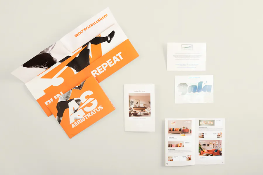
Accordion Into Gate Poster: 80# Uncoated Smooth White Text, 19.5 x 28.8″
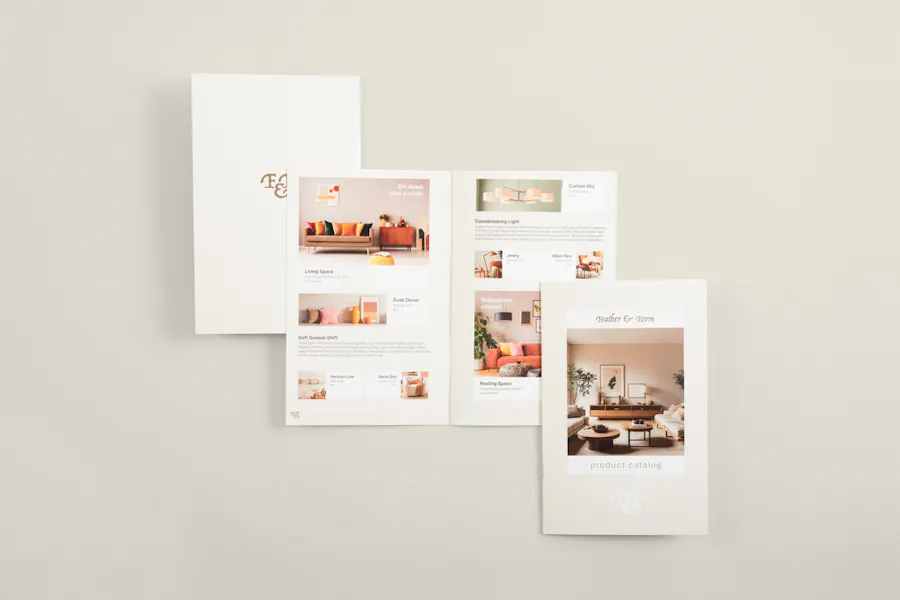
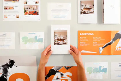
Catalog: 100# Uncoated Smooth White Cover with 100# Uncoated Smooth White Text Interior, 5.5 x 8.5″
What Color is Cloud Dancer?
Technically called Pantone 11-4201 Cloud Dancer, this shade makes sense as the color of the year to some and makes no sense at all to others. Pantone describes it as having “expansive presence” and that it “invites a space where function and feeling intertwine to build atmospheres of serenity and spaciousness.”
If your marketing concepts could use a “visual cleanliness that inspires well-being and lightness,” Cloud Dancer may be the color for you. Pantone refers to it as a key structural color, meaning it’s versatile and supportive of all colors. In other words, it can take a back seat so others may shine.

Jeff, left; Nate, Right
Two Takes on One Trending Tint
But is taking a back seat a good thing? Should a Pantone Color of the Year be in the background? Or does the very nature of being named such a color mean it should take the spotlight? Our designers step into the ring to debate this, how to use Cloud Dancer (or not) and other hue Qs.
In one corner, we have Nate Johannes: Senior graphic designer, domicile chef and lettering addict. For him, Cloud Dancer’s a heck yes.
In another corner, Jeff Barr: Graphic designer, retro game enthusiast and film lover. For him, Cloud Dancer’s a hard no.
Still luxuriating in Mocha Mousse? Revisit our design tips for 2025’s Color of the Year.

“Cloud Dancer has a level of sophistication that connects the piece to its audience by being the hero of the negative space.”
Yes to Subtle Style
What is your overall impression of Cloud Dancer as Color of the Year?
Nate Johannes: “Cloud Dancer is the ‘quiet luxury’ of the color world. Instead of selecting another bold, divisive color, I think this choice demonstrates power through subtlety. It doesn’t need to shout for attention and calmly reflects strength through longevity, giving it the power to transcend fleeting trends and overly bold colors.”
How does the 2026 Pantone Color of the Year reflect the current cultural mood?
“Cloud Dancer arrives at a time when we’ve hit an overload, visually and culturally. After years of hyper-saturated feeds and maximalist look-at-me aesthetics, we’re reaching a point of exhaustion.
“This color is a much needed exhale. I think it’s Pantone’s way of swinging the pendulum back toward restraint and more considered aesthetic choices. Anyone else ready for a little calm?”
Is a neutral, airy color more usable for brands than a bold or divisive shade?
“From a systems perspective, Cloud Dancer is a powerhouse. As a near-white, it expands negative space and adds much-needed breathing room. I think this clarity can be a strong status symbol. It’s the power in a purposeful neutral.
“There’s a reason you know someone’s wearing AirPods from across the street. There’s a reason I love a fresh pair of white Nikes. It acts as a tonal stabilizer, allowing a brand to play with different expressions while keeping its structural integrity intact.”
How does the Cloud Dancer color perform across industries?
“For interiors, spaces open up – it’s the ultimate palette cleanser. It can turn walls into a wonderful canvas and lets natural light create stellar shadows, bringing depth throughout a space.
“For branding and packaging, it signals a level of confidence that says, ‘Our product is so good we don’t need to yell for your attention.’ It’s especially strong when paired with tactile finishes like raised UV or foil.
And Cloud Dancer could sing with print (especially in the hands of an online printer like Smartpress). It has a level of sophistication that connects the piece to its audience by being the hero of the negative space. It could be a minimalist sensory experience instead of a maximum sensory overload.”
How would you use this color in a print marketing campaign?
“I’d use Cloud Dancer not as the background but rather as the stage, creating areas of high contrast and providing proper space for key messaging. It lets typography breathe, gives logos structural integrity and makes tactile print finishes a memorable experience.
“Good design isn’t always about what you add – sometimes it’s more about what you resist. I think of Cloud Dancer as the supporting actor that ultimately steals the show.”

Foil Card: 120# Coated Matte White with Holographic Foil, 5 x 7″
“Cloud Dancer really only shines when it’s supporting a focal color. It’s a bright, sterile waiting room that desperately needs a fish tank.”
When Neutral Isn’t Enough
What is your overall impression of the Pantone 2026 Color of the Year?
Jeff Barr: “It’s a sleepy selection. I think it signals a fearful jog back to ‘safety’ in an increasingly risk-punishing economical climate.”
How does choosing a subtle neutral slow innovation in color-forward industries like fashion and print?
“Colors as understated as Cloud Dancer can have a sedating, comforting effect. Innovation typically comes from noticeable changes and shakeups, neither of which Cloud Dancer is conducive to.”
How does Cloud Dancer perform across industries?
“It’s a great pillar that supports brighter, more vibrant splashes of color. Because of this, it’s very versatile across industries. In the physical print realm, Cloud Dancer helps leave space to push focus toward graphic elements. But over-utilizing it can veer away from calm and into sterile.”
Is a neutral, airy color more usable for brands than a bold or divisive shade?
“Yes, neutrals like this are incredibly useful, in spite of (and because of) its ‘safe’ appearance. Essentially a blank palette, it quietly and succinctly fills spaces and lays foundations within visual landscapes.
“That being said, it really only shines when it’s supporting a focal color. It’s a bright, sterile waiting room that desperately needs a fish tank.”
How would you use this color in a print marketing campaign?
“It’s a great color if you’re trying to save money on ink. Jokes aside, I’d use it as a jumping off point for other real colors to shine.”
Cloud Dancer, Printed to Perform with Smartpress
And there you have it. A knock-down, drag-out fight over controversial Pantone Color of the Year 2026 Cloud Dancer. (Or you know, a totally civilized conversation between designers on the merits of this notable neutral.) Whether you subtly incorporate it into your print marketing campaigns throughout the year or take a stand with one completely focused on it, Cloud Dancer makes noise your messaging may need.
And when you’re ready to begin designing print assets with it, Smarptress has the experts and premium products to make it a success.