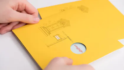
Vibrant Brochure Printing: Revealing an Agency’s Brand Evolution
Eva Day is a creative director known for her wizardry when it comes to illustrating masterpieces on the spot from even the faintest idea. At Alexandria, VA ad agency, Williams Whittle, Day’s artistic skill is on full display, whether she’s executing a concept at her desk in no time or graphically recording a keynote speaker in real time at one of her agency’s nonprofit conferences. Or in this case, elevating brochure printing to showcase a brand evolution.
Key Takeaways
- To celebrate Williams Whittle’s 50th anniversary, Creative Director Eva Day crafted a striking brochure featuring circular die cuts, roll folds and a refreshed, vibrant color palette. As the self-described “Die Cut Queen,” she used bold shapes and layered design to spotlight key messages and illustrate the agency’s evolving identity.
- Moving away from historically inspired hues, Day introduced teal and yellow to the agency’s traditional brick red—breathing new life into the brand while balancing respect for its legacy. Despite initial hesitation from leadership, the updated palette successfully modernized the agency’s image without disconnecting from its roots.
- From intricate die cuts to foldable layouts, the tactile power of print elevated storytelling and engagement – something less common in today’s digital-first world. With Smartpress’ custom brochure printing services, Day brought her bold vision to life with precision, personality and professional polish.
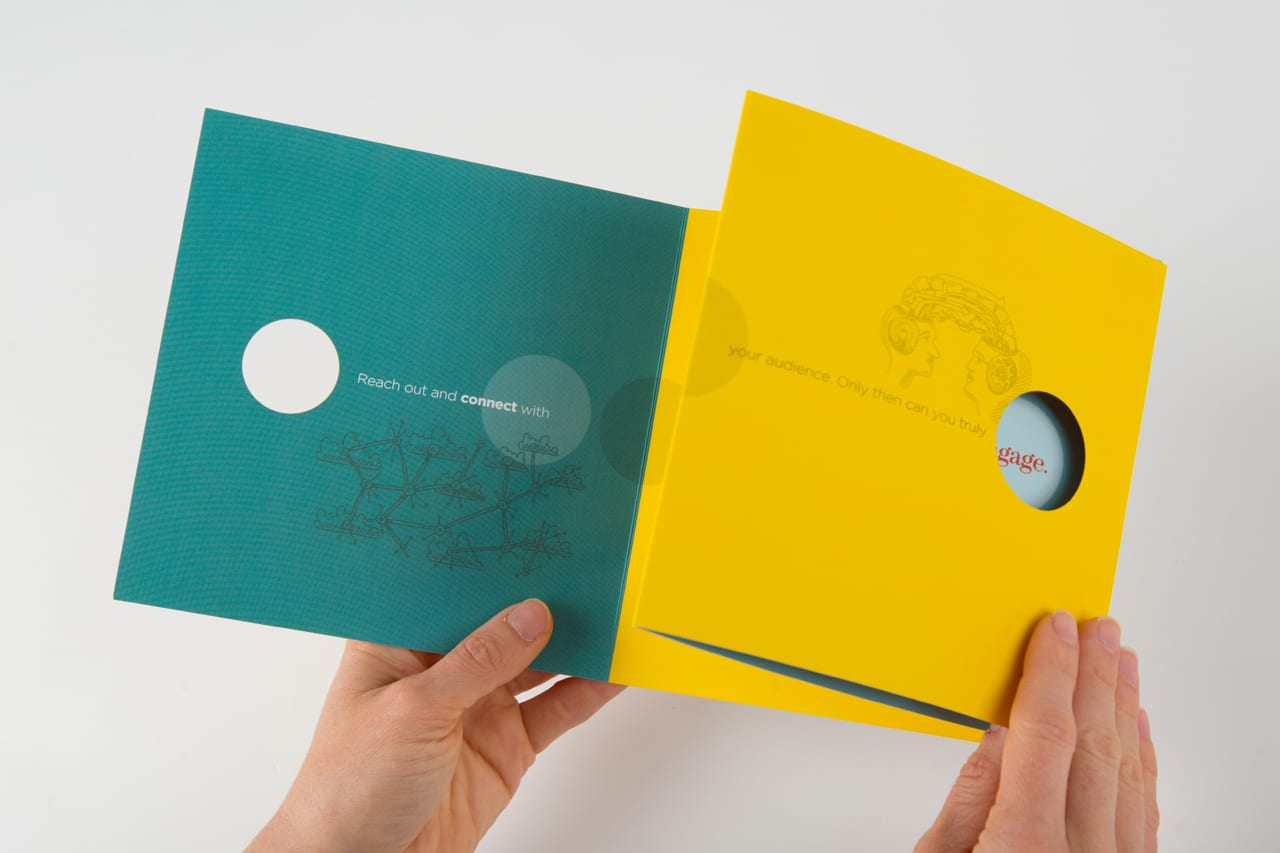
Layered circle cutouts by the “Die Cut Queen”!
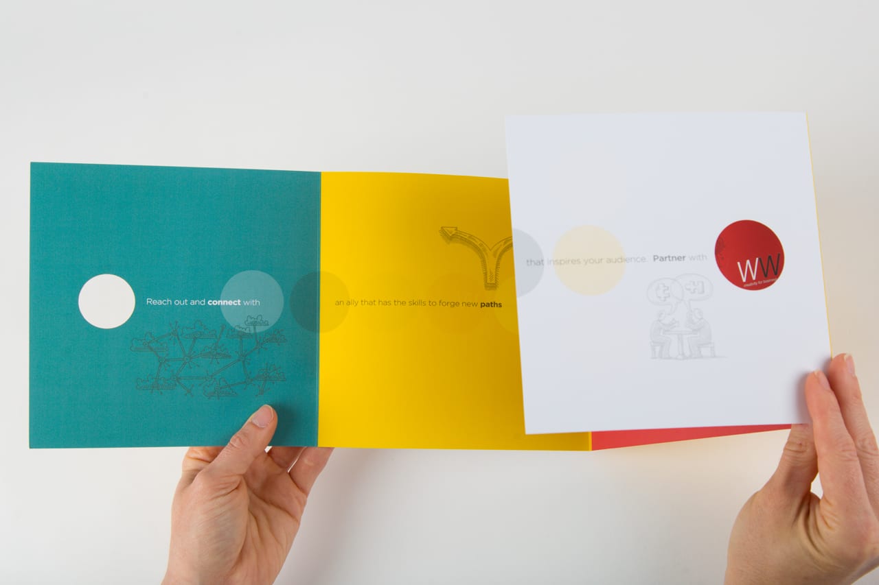
Prominent circles draw attention to highlight messaging
Circling the Date With Custom Print Options
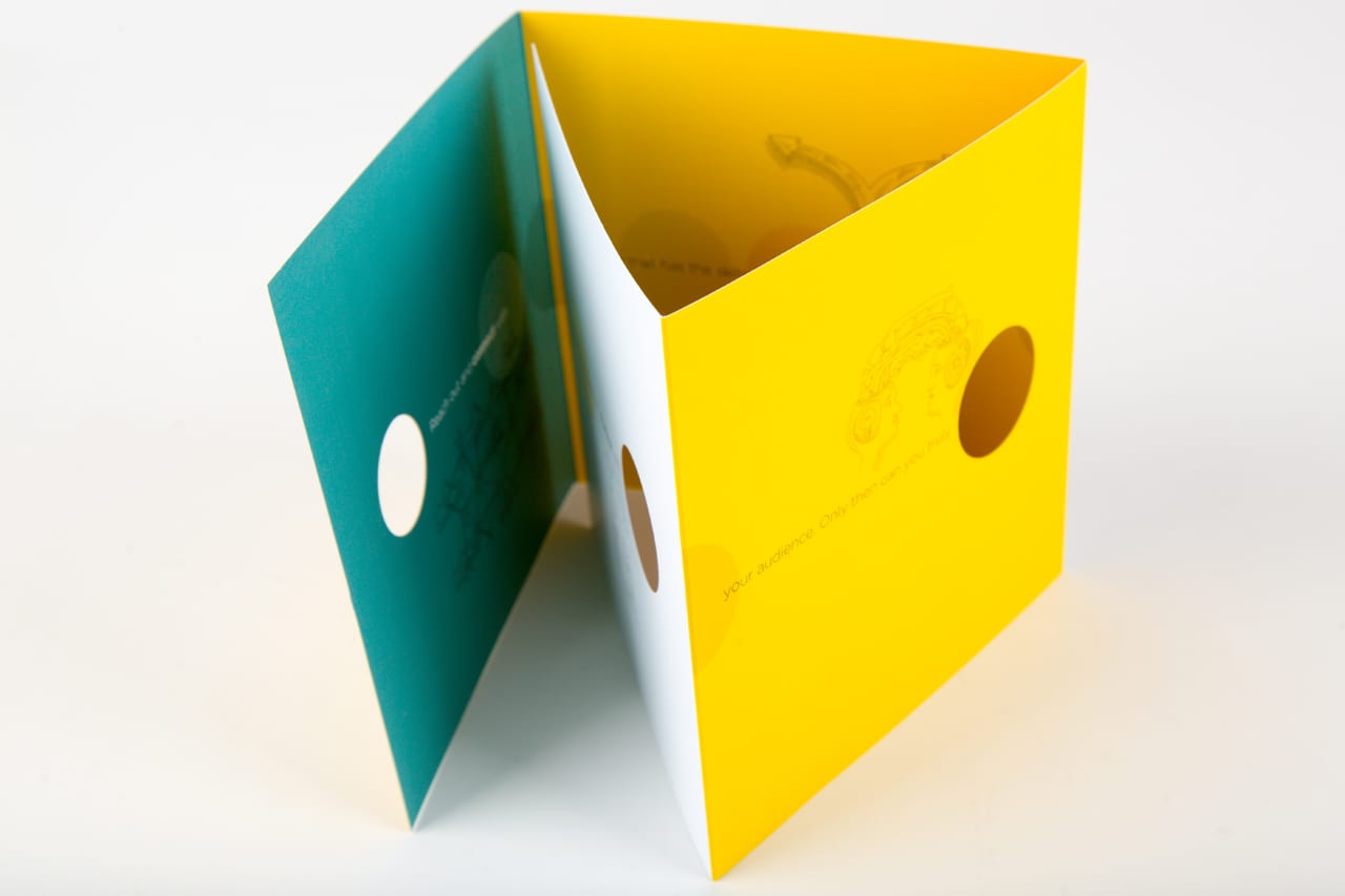
“As part of our agency’s 50th anniversary, we decided to update our branding materials to reflect the milestone,” Day said. “I zeroed in on a circle shape to help draw attention and highlight messaging. Since they call me the die-cut queen, I went there. I did multiple circular die cuts, added roll folds and a new, brighter color palette. Then I huddled with our writer to come up with the right words and illustrations to tell our story.”
Luckily, Smartpress’ world-class online printing services include brochure printing with a plethora of folding ideas, paper stocks, UV coatings, and of course, digital laser cutting, to accommodate custom projects like Day’s.
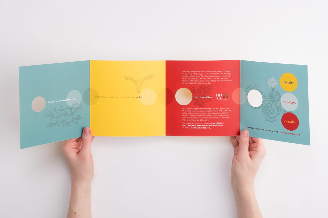
Brochure features brand’s bright new color palette
50 Years Young
“Williams Whittle is an agency steeped in history,” she explained. “The shop is actually housed in the former home of George Washington’s pastor and friend, the Rev. Thomas Davis. Agency lore is that George often dined here. Which is one of the reasons the partners had always relied on historical colors when it came to its branding palette.”
“And while the agency’s been around a long time,” she said, “I wanted to make sure that even after 50 years, we didn’t look out of touch. Frankly, color choices can have a lot to do with that.” Whether for projects in black or full-color ink, Smartpress is the online printer for the job.
“To be honest, I wasn’t sure how our CEO would feel when I first proposed the addition of teal and yellow to their traditional brick red colorway but I thought the infusion of color would give it just the makeover it needed. It was brighter, more vibrant and didn’t date us,” Day said. “Admittedly, it took a few conversations before Rob finally agreed.”
“I wanted to make sure that even after 50 years, we didn’t look out of touch. Frankly, color choices can have a lot to do with that.”
Drawing on History & Expertise
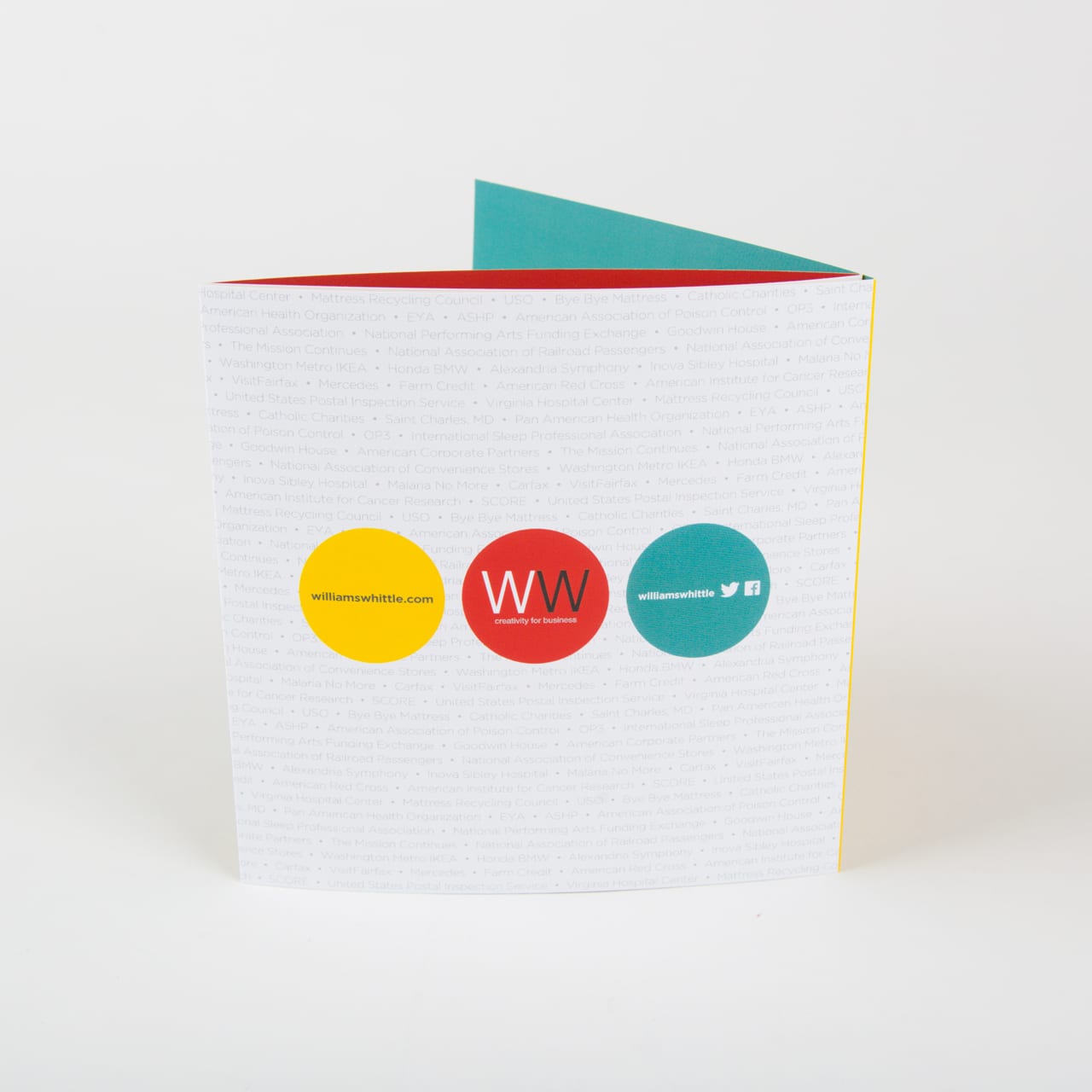
“We introduced the new color palette with this 6″ x 6″ roll fold and our booth display at the annual nonprofit conference that we host,” she said. “The illustrations scattered throughout the piece are a nod to a couple of things WW is known for – our historic front door which is said to have regularly welcomed the Father of our Country and the sketches I do during keynote addresses at our regularly sponsored conferences. It’s something the agency is known for. And, I guess me, too.”
No Plan B for Brochure Printing
“Good die cuts are not easy, especially layering them the way I did,” Eva said. “So it was a little nerve-wracking. We were on a time crunch, and if it didn’t go well, there wasn’t time to do anything else.”
“When the sample arrived, I couldn’t have been happier. It looked exactly the way I had pictured it,” she said. “The circles lined up and the colors were as vibrant as I had hoped.”
From tri-folds to accordion folds, closed gate, double parallel folds, online printing with Smartpress let Day do it all. “I love interesting folds and die cuts. I always have,” Eva continued. “Unfortunately, we don’t get to do that much anymore. Everything is digital nowadays, so when I get a chance to do a piece that you can touch, I really go to town.”
Hint: Want more brochure printing inspo? Here you go:


