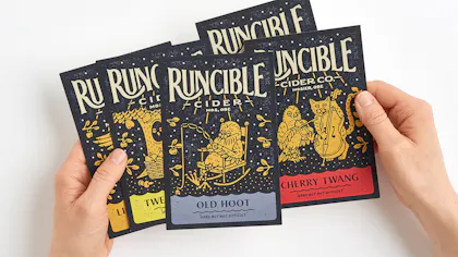
Drawing from Whimsy: Runcible Cider Prints Promotional Postcards
Key Takeaways
- Inspired by an Edward Lear’s poem, illustrator Nathan Yoder built the Runcible Cider brand with hand-drawn characters, type and folk-style art that gave the brand a whimsical, heritage feel from logo to label to postcard.
- Yoder’s return to traditional illustration helped distinguish Runcible Cider in a digital-first world. His pen-and-ink drawings, limited color palette and hand-rendered typography brought tactile authenticity to the cider’s story.
- With Smartpress, Yoder turned detailed illustrations into high-quality custom postcards, choosing paper, stocks finishes and colors that matched the original artwork perfectly. The result: cohesive, character-rich promotional pieces that reflect the brand’s artistic roots.
Strong brands often develop out of simple ideas. Building off a whimsical children’s poem to create an entire world around Runcible Cider, illustrator and designer Nathan Yoder gives the brand a historic feel with a story to tell. And that story includes strategic promotional postcards.
Designs Inspired by Utter Nonsense
The English artist, illustrator, musician, author, and poet Edward Lear first published his famous nonsense poem, The Owl and the Pussycat, in 1871. Nearly a century and a half later, the whimsy of Lear’s poem inspired the brand behind Runcible Cider, an Oregon cidery that takes its name from Lear’s favorite nonsense word, runcible.
Nathan Yoder, described on the Runcible site as the “Illustrator/designer of all things runcible,” pieced the brand together with hand-drawn illustrations and type as delightful as any passage from Lear. By creating characters and vignettes inspired by the poem, Yoder helped build a brand that reflects its storybook essence and gives cider drinkers something to get excited about.
“With everything being so digital today, it’s nice to be able to get off the computer a little bit.”
A Return to Illustration
Yoder grew up in a small town in Oklahoma. He discovered drawing at a young age and by high school was designing for a local T-shirt company. After studying design in college, he took a job with an agency in Tulsa and later with a startup in Southern California, but found himself unsatisfied with corporate design.
“I tried to retrace my steps back to the days when I was drawing,” he recalled. “With everything being so digital today, it’s nice to be able to get off the computer a little bit.”
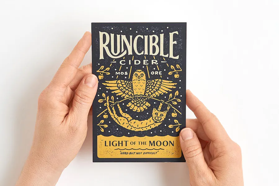
Owl & Pussycat Illustration that became the brand’s main logo
Chance Encounters
Yoder struck out on his own, taking on freelance projects that let him blend his illustration style with his design skills. He moved to Portland, Oregon and later to Edmond, Washington where, thanks to the vast online communities of Instagram and Dribble, Yoder’s style drew the attention of Runcible Cider founders Rob Miller and Kelly McCune.
“Rob and Kelly just bought an orchard in Oregon, so they were literally starting this thing from scratch,” said Yoder. “When they first came to me, they didn’t even really have any cider.” What the couple did have, however, was a vision for Brand Runcible, based around the Edward Lear poem.
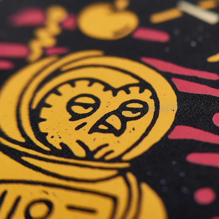
Yoder uses thick-line pen and ink work to achieve a folk art look
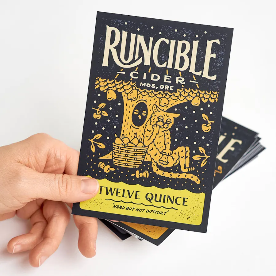
All typography was hand-rendered by Yoder
Fermenting the Idea for Print
After sharing images and inspiration, Yoder, Miller, and McCune arrived at what Yoder describes as, “Almost a classic children’s book approach to illustrating the characters.” Starting with the owl and the pussycat that became part of the Runcible logo, Yoder was able to expand the imagery as the Runcible cider varieties—and the brand’s story—grew.
Yoder approached the illustrations as he might have in Edward Lear’s 19th century England, limiting the color palette and using thick-line pen and ink work to achieve a folk art look. Even the typography was hand-rendered by Yoder, giving the brand a heritage feel harmonious with the cider space.
The project unfolded over the course of a year while Runcible was developing its first varieties, starting with the logo and then moving on to labels several months later. “They’ve honestly just been your quintessential client,” said Yoder. “We’d work on something, and everybody would go their own way until something else came up.”
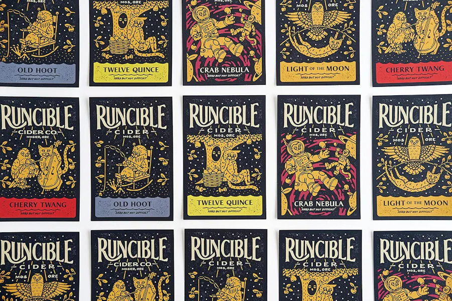
Printing Digitally With Custom Options
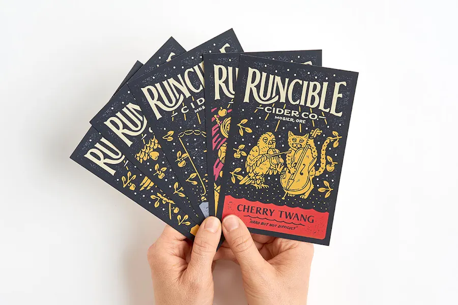
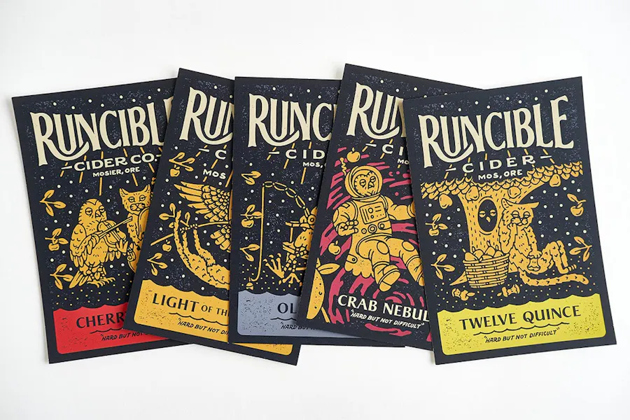
Runcible and Yoder turned to Smartpress and our online printing services for a series of custom postcards to promote the brand’s cider varieties. After the craftsmanship that had gone into illustrating and printing the cider labels, carrying it across to digitally-printed postcards was a mild concern for Yoder.
“When it’s digital printing, for instance, I think it just comes down to color, for me, and paper choices,” said Yoder. He ordered a free Paper Sample Book from Smartpress and found exactly what he wanted for promotional postcards. When he saw the finished product, according to Yoder, color was a perfect match. “It’s good when everything’s speaking the same language,” he said. “I was definitely impressed with the quality.”
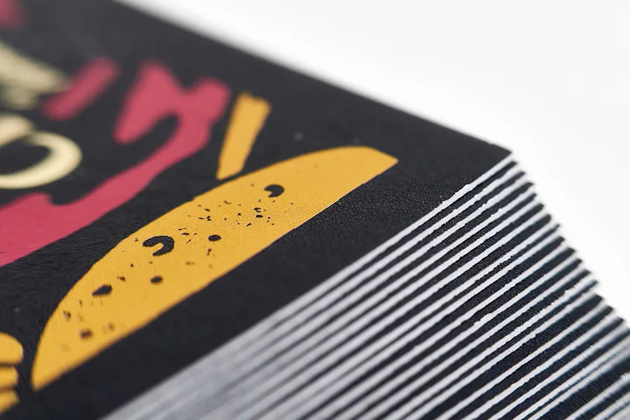
Not only does working with an online printer like Smartpress mean Yoder had premium stock options for promotional postcards, but also cover weight choices, black and full-color ink, Soft Touch laminate, UV coating and shrink wrapping features to play with.
The Strength of a Relationship
Yoder continues to work ad hoc with Runcible as the cidery develops new varieties for online printing. He reflects back on the wisdom that Miller and McCune demonstrated in carefully selecting who would bring Runcible to life.
“I think when you’re wanting to apply a certain kind of personality, or you’re wanting to convey a certain kind of emotion through a project, I think that’s when it’s important to find the right artist for the job,” said Yoder.
“It’s helped me realize how to recognize a good relationship when it presents itself,” he continues. “As a whole, I think this Runcible project is one of those projects where I feel like I, in some ways, lucked out.”
Hint: See how more customers used promotional postcards for marketing and more: