
Redesigning the Smartpress Brand
Our Creative and Marketing teams took a hard look at the state of the Smartpress brand. As a premium online printer, we still had a large list of loyal customers, but our website had become significantly outdated. The Smartpress logo and aesthetic were overwhelmingly generic, and our teams had never aligned strategically on who our target customers were or should be. Needless to say, we had a lot of work to do.
We set out on what would be a nearly year-long journey to redefine our brand direction, visual identity and website. It would now be an understatement to say that there has been a change at Smartpress.
Key Takeaways
- Smartpress undertook a comprehensive rebrand to better align with its core audience—designers and creative professionals—leading to a clear new mission: “To inspire and enable creative professionals to create brilliant print.”
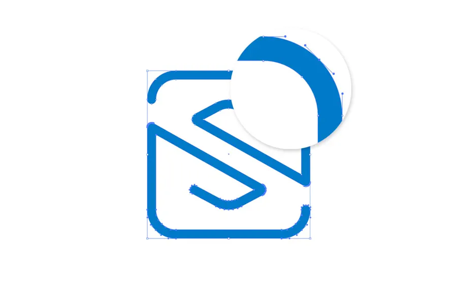
- The new logo symbolizes the collaboration and trust between Smartpress and its customers, visually represented through intersecting elements forming an “S” and a handshake-like shape, highlighting the shared role in producing quality print.

Smartpress logo concept sketches by Ross Bruggink
Our Brand Mission: Create Brilliant Print
During our rebranding, we discovered that a large portion of our customers were designers and other creative professionals. The new Smartpress online printing brand needed to resonate with this savvy group in both design and messaging. We also wanted our new brand to deeply connect our company and our customers with a shared purpose, and so our new brand mission was created:
“To inspire and enable creative professionals to create brilliant print by providing them with the best technology, education, and service in the world.”
In short, our new brand promise is to Create Brilliant Print. All of our design and messaging will now be in this spirit and will be focused on instilling the trust and confidence in our customers that we will deliver on this promise.
A New Visual Identity for Smartpress
Next came the task of putting everything about this new brand of ours into a singular visual representation – a new Smartpress logo. Throughout the concept phase, a few themes developed. We wanted the logo to portray the relationship between Smartpress and our customers. This idea started to come to life in visual form by having two independent design elements (one for us and one for our customer) create one cohesive shape.
We also started to think about how our customer relationships really work. Our customers create a beautiful design, then they put all of their hard work into our hands. They trust us to make the final product live up to their original vision. That moment of interaction, that trusting hand-off from design to production, is where creating brilliant print is actually made possible.
We began to use visual metaphors, like a spark, to illustrate that moment. In the final logomark, this concept is shown by the “S” that is created in the center where the two lines meet. The bottom-left and top-right halves coming together is also reminiscent of a handshake.
Another goal of the logo design was to make something very complex (like our printing process and online printing services) seem more approachable. The linework in the mark is intricate, yet simple. The typography in the logo was designed to have a uniform, monospaced feeling, commonly found in fonts used for computer programming. This added a precision to the logo.
However, this techy-touch was simultaneously contrasted by subtly rounding the strokes and terminals of the characters. During our research, we discovered that 60% of our customer base was female, so these softer design touches helped make the styling of the mark appear more friendly and slightly less masculine.

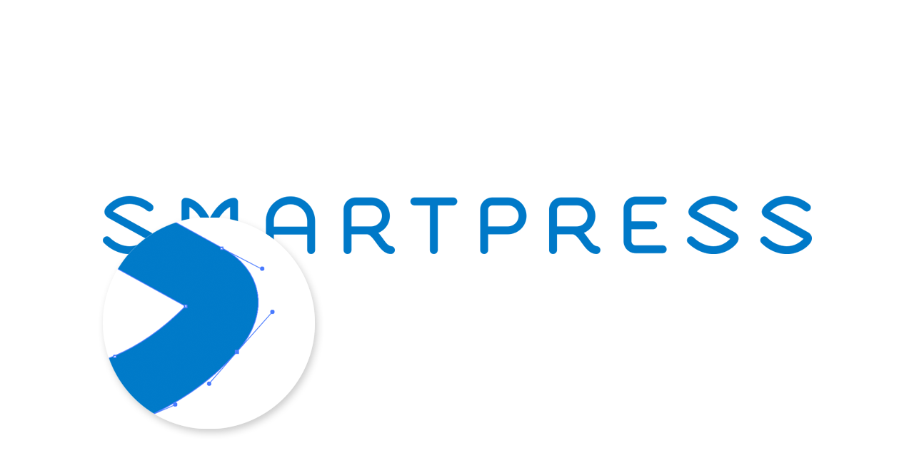
Final Smartpress Logo Design
It’s been an adventure and a lot of hard work, but it was well worth the effort. We’re excited that we now have a brand identity that communicates the passion behind what we do every day here at Smartpress. We’re also more confident than ever that we are more accurately representing our true identity to our customers.
Hint: Want to see other ways we continue to evolve? Have a look: