Brand Launch: Designer Infuses Fine Art into Print Branding

Rob Patterson // Kilogram Tea Posters
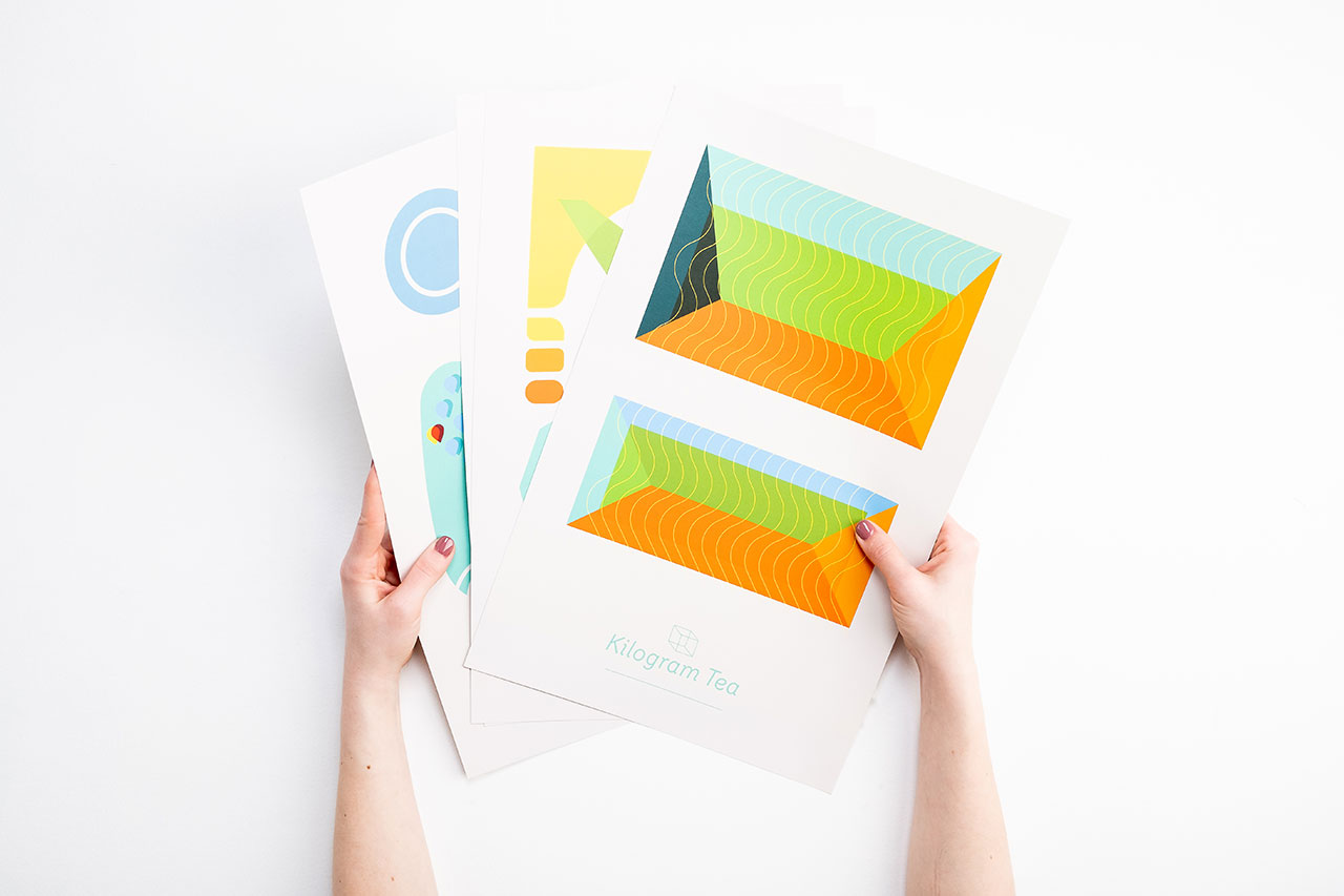
As the sole designer at Intelligentsia Coffee, Rob Patterson designed a variety of print branding from packaging to promotional mugs. When he was charged with designing a poster series for the recently spun-off Kilogram Tea brand, Patterson returned to his fine art roots and illustrated an eye-popping series of abstract images that connect with the flavors and philosophies of the teas they promote.
Key Takeaways
- Fine Art Foundation Fuels Brand Identity: Rob Patterson’s background in fine art and illustration deeply influenced the abstract, visually rich poster series he created for Kilogram Tea, blending personal artistic roots with brand storytelling to elevate the new tea line’s identity.
- Rather than relying on generic visuals, Patterson immersed himself in the world of tea, learning about its cultivation, talking to farmers and drawing from Kilogram’s color-coded packaging, to craft posters that visually represent the flavor, origin and philosophy of each tea.
- After initial designs were deemed too similar to Intelligentsia’s coffee branding, Patterson started over and embraced a more experimental, abstract direction. The result was not only a memorable print series, but also a large-scale installation at Intelligentsia’s Millennium Park store that reinforced Kilogram Tea’s distinct presence.
As a child, Rob Patterson drew monsters. He spent a lot of time in the Smoky Mountains and in the rural areas around his home town of Greenville, South Carolina teaching himself to draw and paint and being by himself in nature.
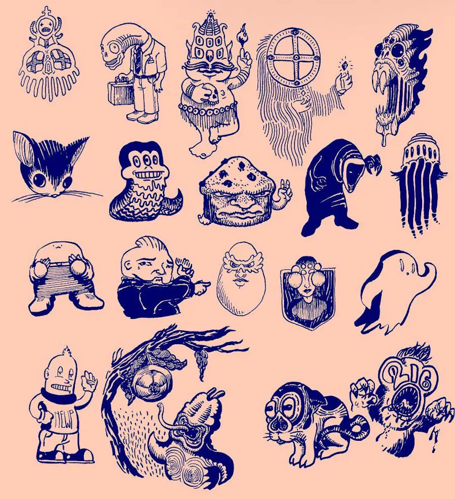
ROB HAS BEEN DRAWING MONSTERS SINCE HE WAS A CHILD

Smoky Mountains in Greenville, SC where Patterson grew up
When his parents recognized that his passion for art wasn’t fading, they transferred him to Greenville Fine Arts Center High School. There, he was exposed to a full range of artistic practices, like painting, film, ceramics and metalworking. He later went on to study digital fine art at the Atlanta College of Art. “I was thinking about illustration, but I was really just trying to figure out what to do,” he recalls.
Convinced by a professor that a graphic design degree would give him the freedom to learn illustration while also getting paid, Patterson pursued the tools of graphic design while indulging in fine art. During a semester abroad in Cortona, Italy, he befriended world-renowned painter Terry Rowlett.
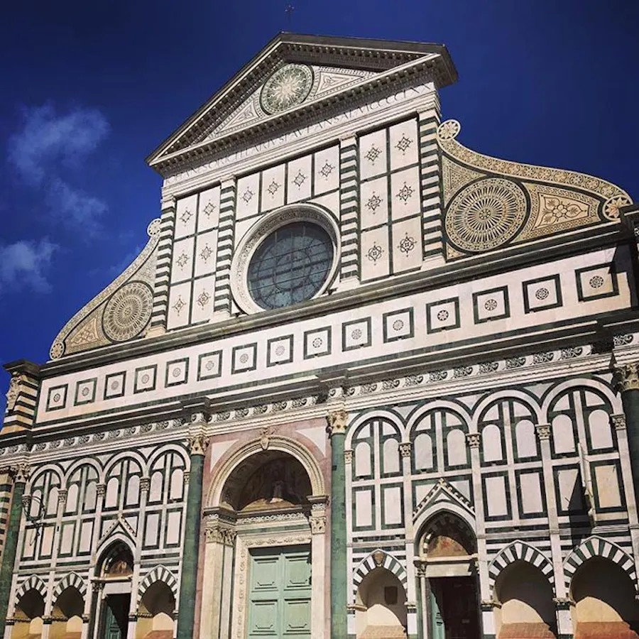
“Terry welcomed me along to explore the art-steeped villages, lush landscapes, and wines of Tuscany,” Patterson says. While there, Patterson studied intaglio printing and photography, and, through Rowlett’s eyes, learned to appreciate Renaissance art.
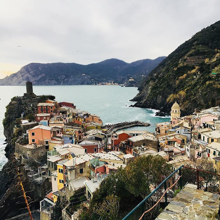
Photos from Patterson’s travels in Italy
Reading the Tea Leaves
On his return to Greenville, the small southern community had few openings for a freshly minted artist and graphic designer, so Patterson looked farther afield. First, in Nashville, he took a job preparing assets for a photography show.
Then, drawn to Chicago where his girlfriend and future wife, Amy, was pursuing her career, Patterson began freelancing. He found work with studios and agencies, and also did projects with Goose Island Brewing as well as the bands Pedro the Lion and the New Pornographers.
As with many beginning freelancers, Patterson also took a job as a barista. Working behind the bar at Intelligentsia Coffee, he learned the nuances of the brand and its unique Direct Trade program, which cuts out middlemen by connecting directly with coffee farmers, producers and their communities around the world.
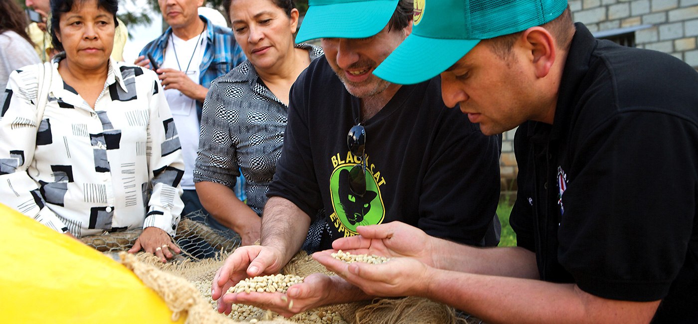
Intelligentsia’s direct trade buyers working with regional farm
A social media post put Patterson’s career on the fast track. “One night my wife noticed that Intelligentsia had posted a job for a multimedia designer,” he says. So he applied. “I knew the brand, I knew the company and I liked what they did.”
Drinking it All in
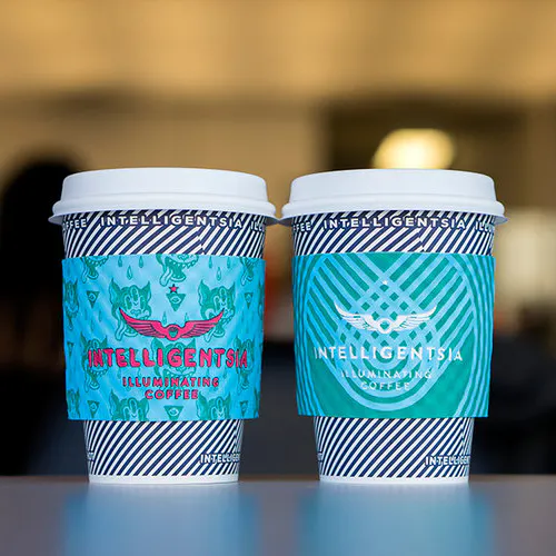
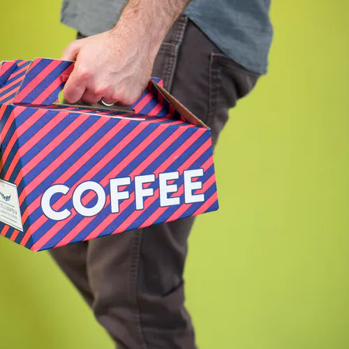
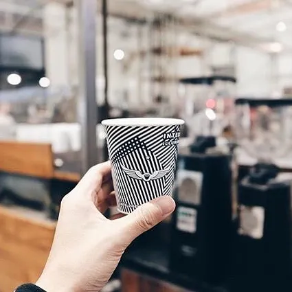
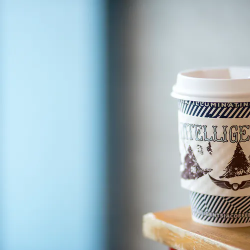
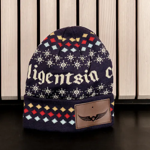
Landing the job as the only designer at Intelligentsia, Patterson found himself immersed in print branding. “Anything from neon signs to posters, and lots and lots of merch. Shirts, hats, promotional materials, packaging, all kinds of things.”
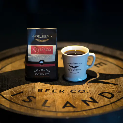
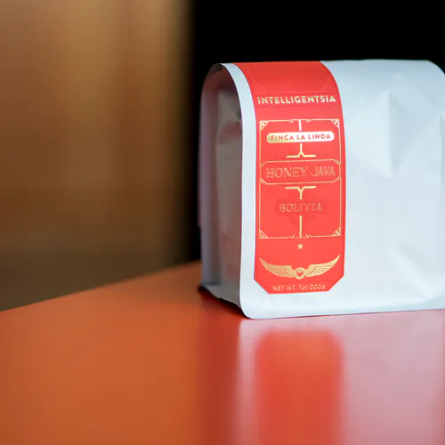
The Direct Trade program at Intelligentsia called on Patterson to create packaging that reflected each individual coffee farm. “I was fascinated by their culture and lore, so I would reach out directly to the farmers and buyers to find out specifics about the places and the people,” he says. To create the package designs, “I tried to pick out small details that made each place unique, things like cultural ties.”
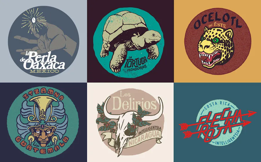
Patterson’s logos for the Intelligentsia direct trade coffee program
Patterson and Intelligentsia also began a magazine series about the farms the brand partners with. “We worked on a bunch of little mini biographies for all these farmers and their regions,” he says.
Patterson also rebranded the entire Intelligentsia coffee line. “I’ve got all these logo marks that run the gamut of styles. It was a really fun and inspiring exercise.” He let the region and its mythology drive how the logo would look, resulting in a wildly varied set. “We still had our main logo, the wings and star, that anchored everything,” he says.
The Briefest of Briefs
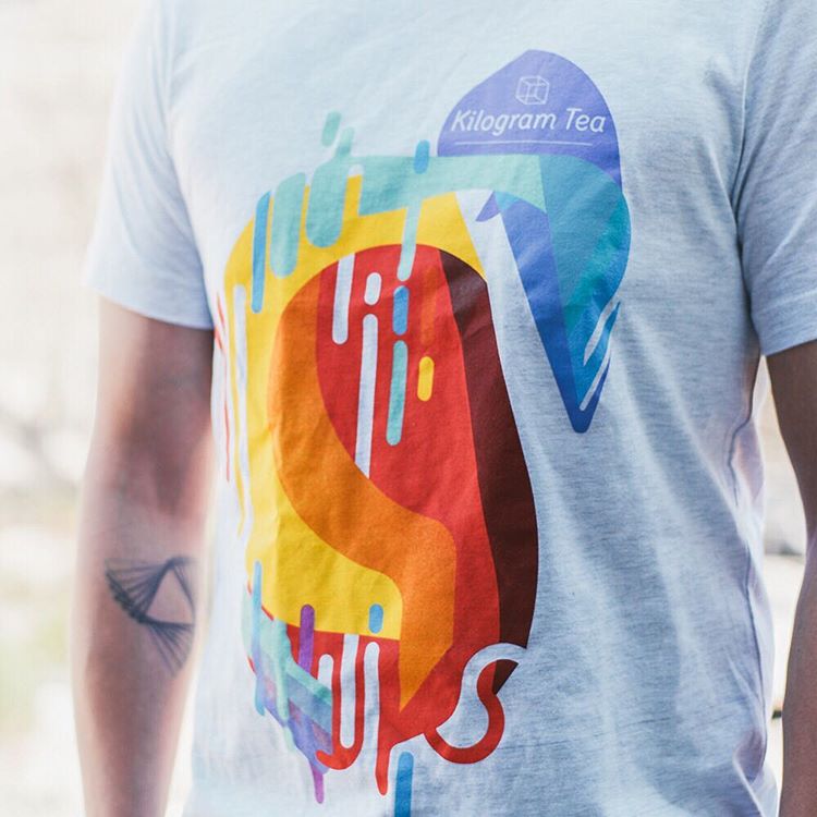
When Intelligentsia spun off its tea business into a separate company, Kilogram Tea, the print branding took on a voice of its own. “The rebrand focused on this ephemeral idea of the flavors of teas, which can be totally amazing,” Patterson recalls.
To help market the new Kilogram brand, Intelligentsia charged Patterson with creating a poster series to send out to shops and distributors. The brief was straightforward. “The owner, Doug Palas, wanted something people would keep and told me, ‘Just do something cool.’”
Poster printing with an online printer like Smartpress means options galore. Offering both Small Posters and Large Posters, our online printing services let you customize everything from coated and uncoated stocks to black and full-color ink to UV coating, laminates, mounting supplies more. File setup is simple, as you create personalized posters for any occasion.
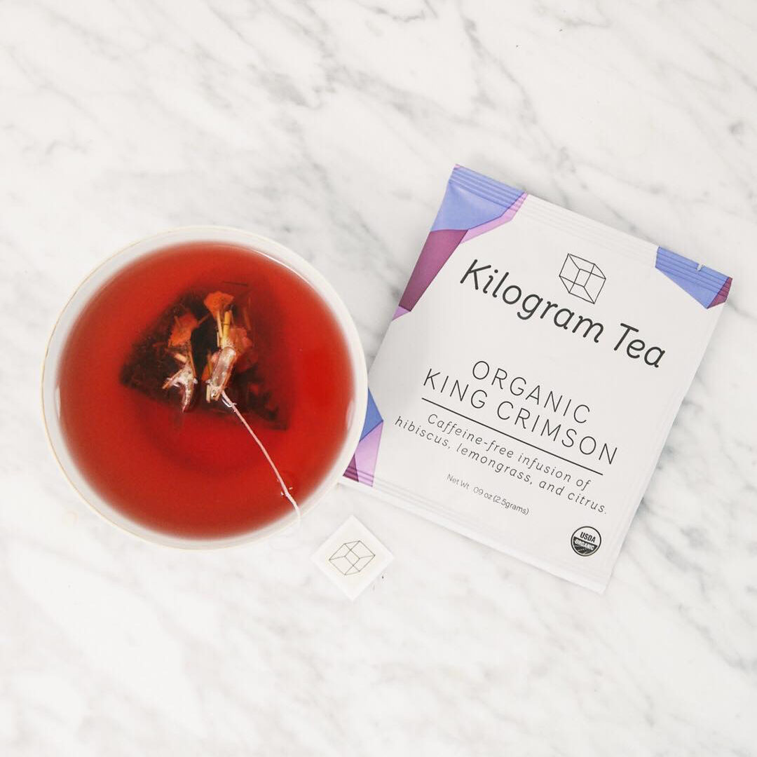
After a few misfires that were too close to the Intelligentsia brand, Patterson found inspiration in the Kilogram Tea packaging. “There’s a very specific color scheme, three colors for each type of tea. Together they form this abstract landscape that’s interesting,” he says. For the posters, “I wanted to make it more abstract and fun.”
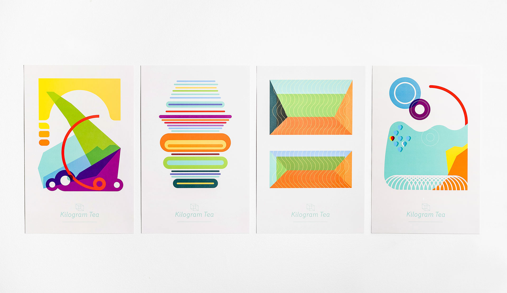
Patterson deliberately took time to learn everything he could about the tea. “Drinking it, talking to the farmer to find out where it’s grown and how it was processed,” he recalls. Then he picked color schemes and forms that best invoked the individual tea’s flavor, origin and lore.
“I had no color training in college, I never took color theory,” he continues. With each poster’s many objects, layers, and transparencies, it was a challenge translating from screen to print. “I tried a whole bunch of different ways to deal with it, but ultimately it was the prepress team at Smartpress that figured it out.”
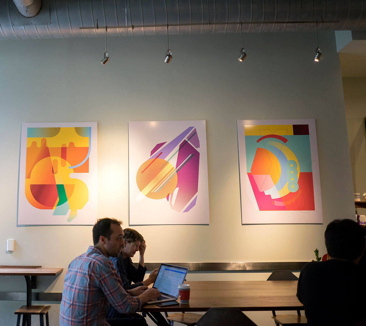
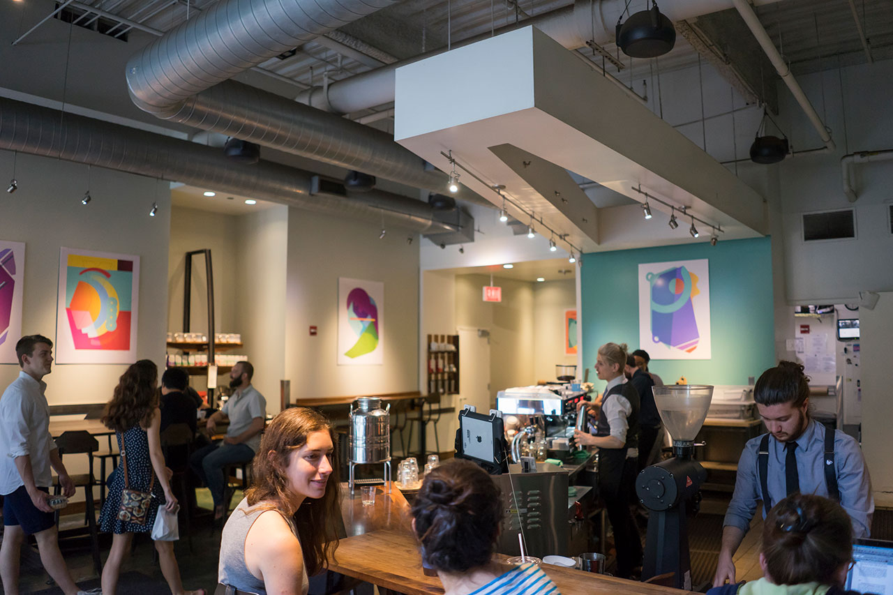
Kilogram Tea posters at the Intelligentsia Millennium Park store
Going Big With Print Branding
As an adjunct to the Kilogram promotional posters, Intelligentsia chose a selection of Patterson’s graphics to enlarge for its Millennium Park store in Chicago. “I told them that the posters would be really cool enlarged and hung on the walls, and that it would draw focus on Kilogram Tea.”
Looking back on the custom poster project, Patterson considers the difference between his fine art schooling and his graphic design career. He finds himself glad that his initial efforts were rejected and he had to start again. “It allowed me to elevate the brand and the experience, and it was a good reminder that you have to separate yourself from your work and your ego.”
Hint: Get more print branding inspiration from Patterson:
