Design Adventure: Printing Booklets as Brand Manuals
Mark Rantal is a Colorado creative director who firmly believes everyone can be just a little bit better at everything if they stick with it. And he uses himself as a case in point. As an art student, he spent many hours a day teaching himself how to use the programs that he now uses daily. It’s a persistent streak that has not only helped him hone his graphic skills, but also tackle some of the most demanding projects of his career – like the OutThere brand manual.
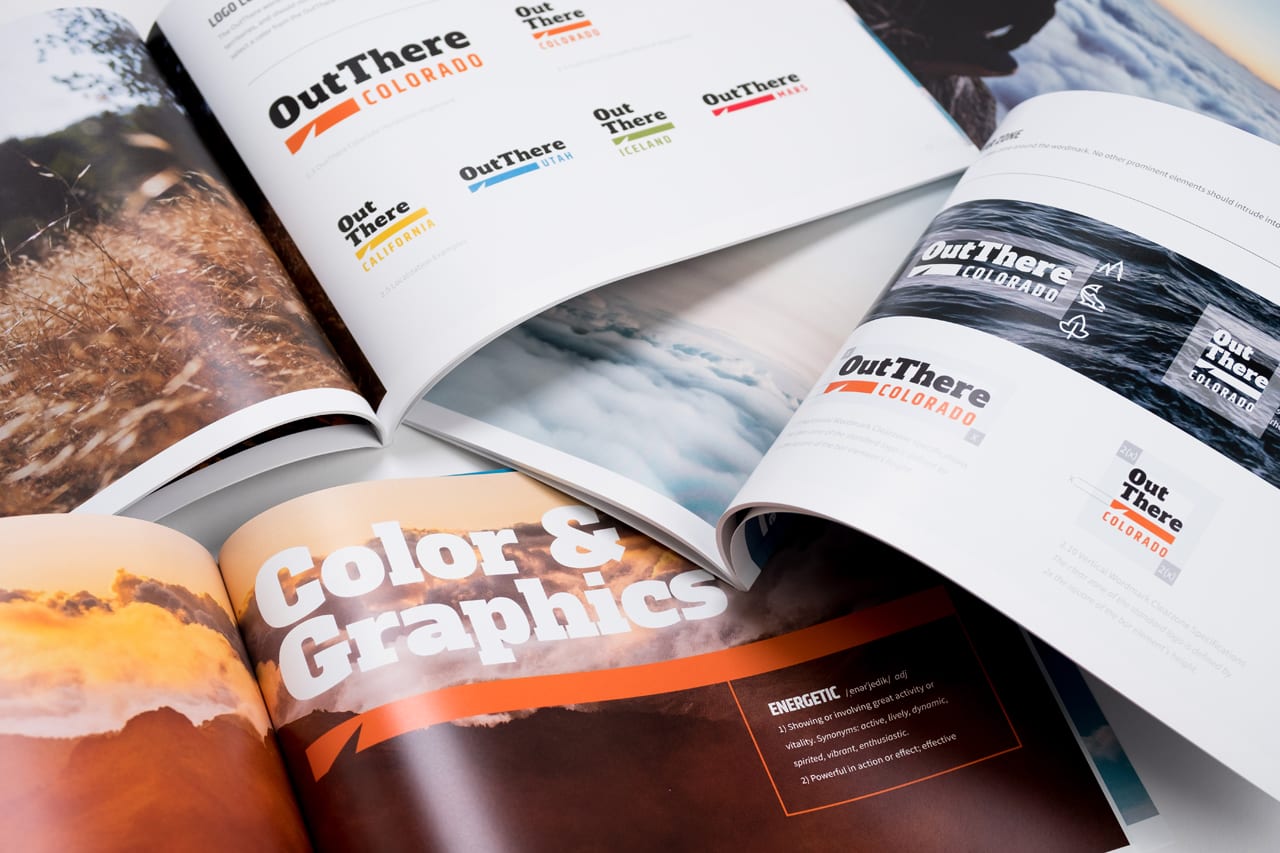
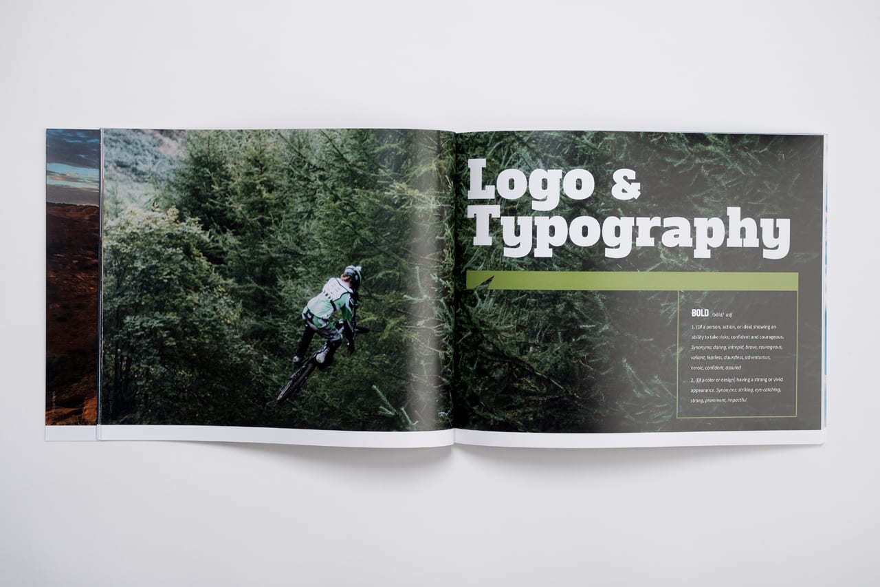
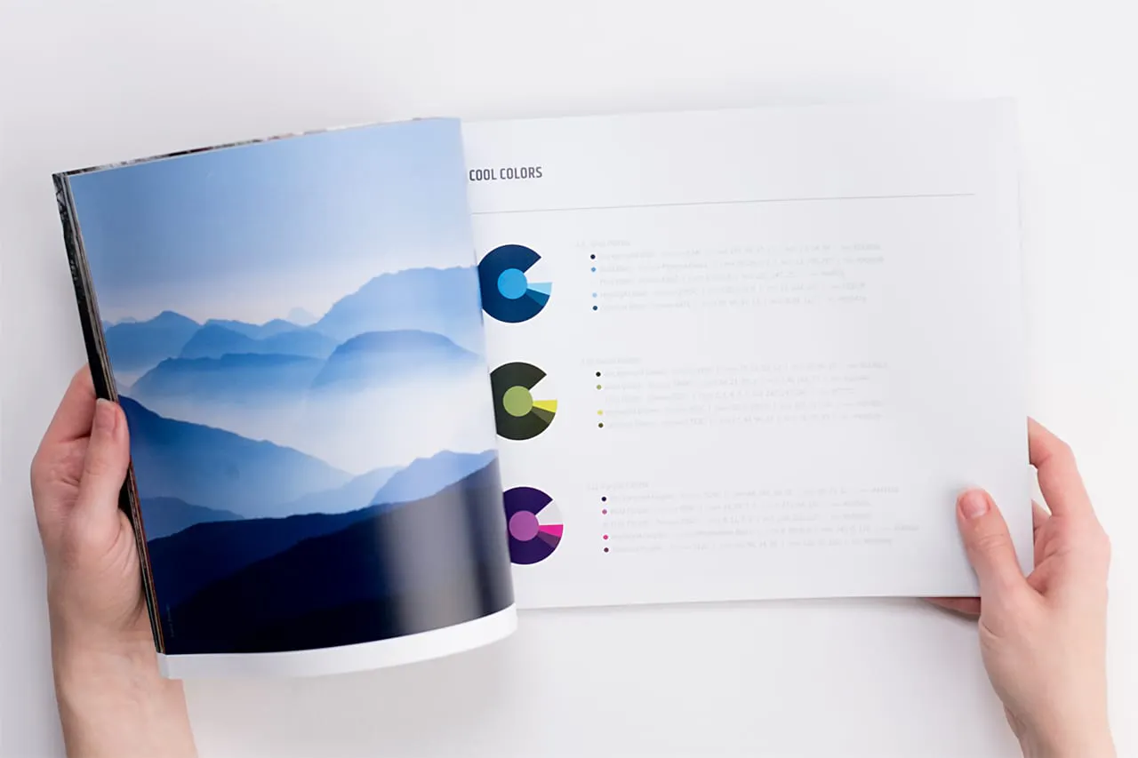
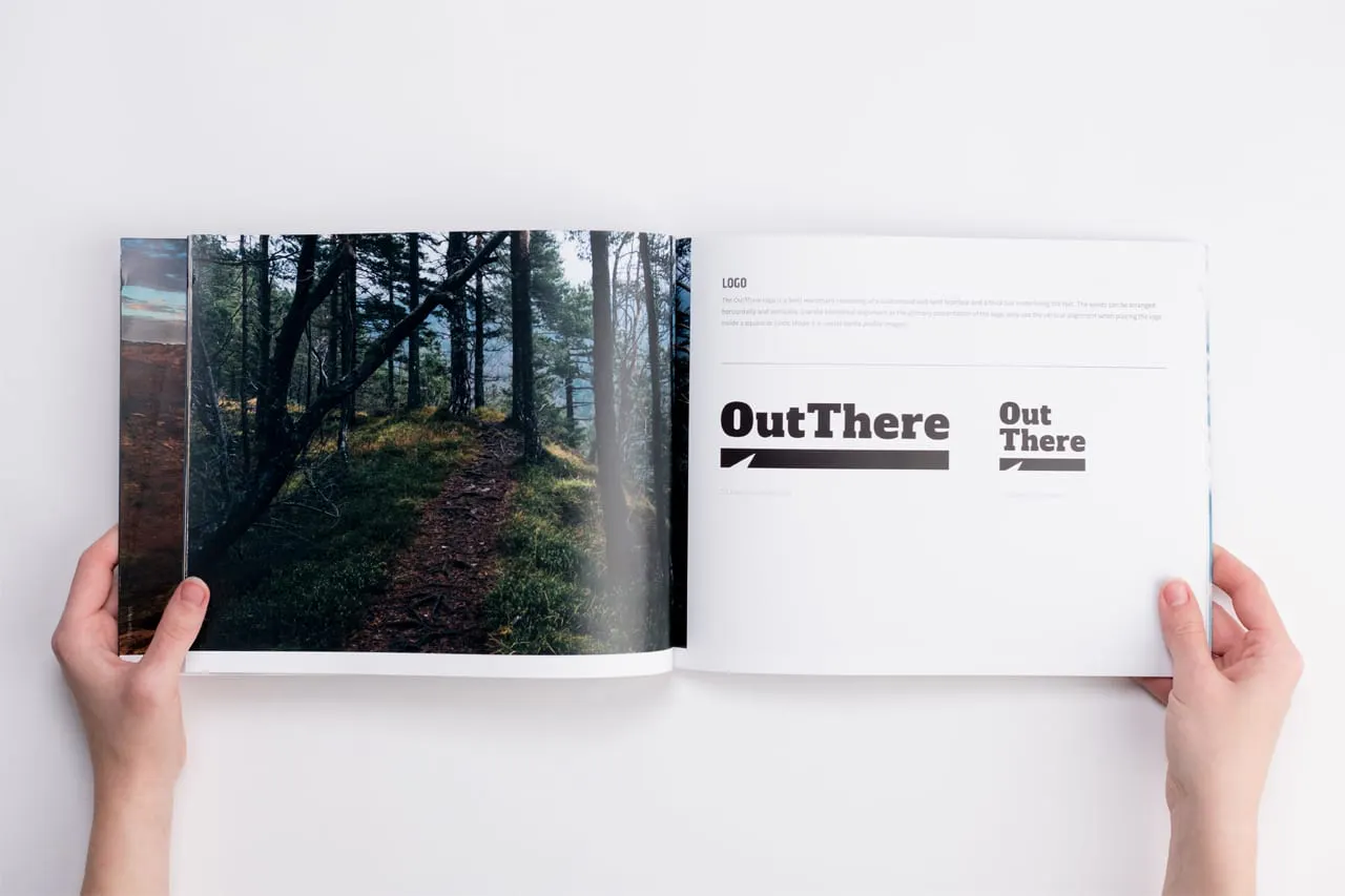
Bold type and energetic color reinforces brand attributes
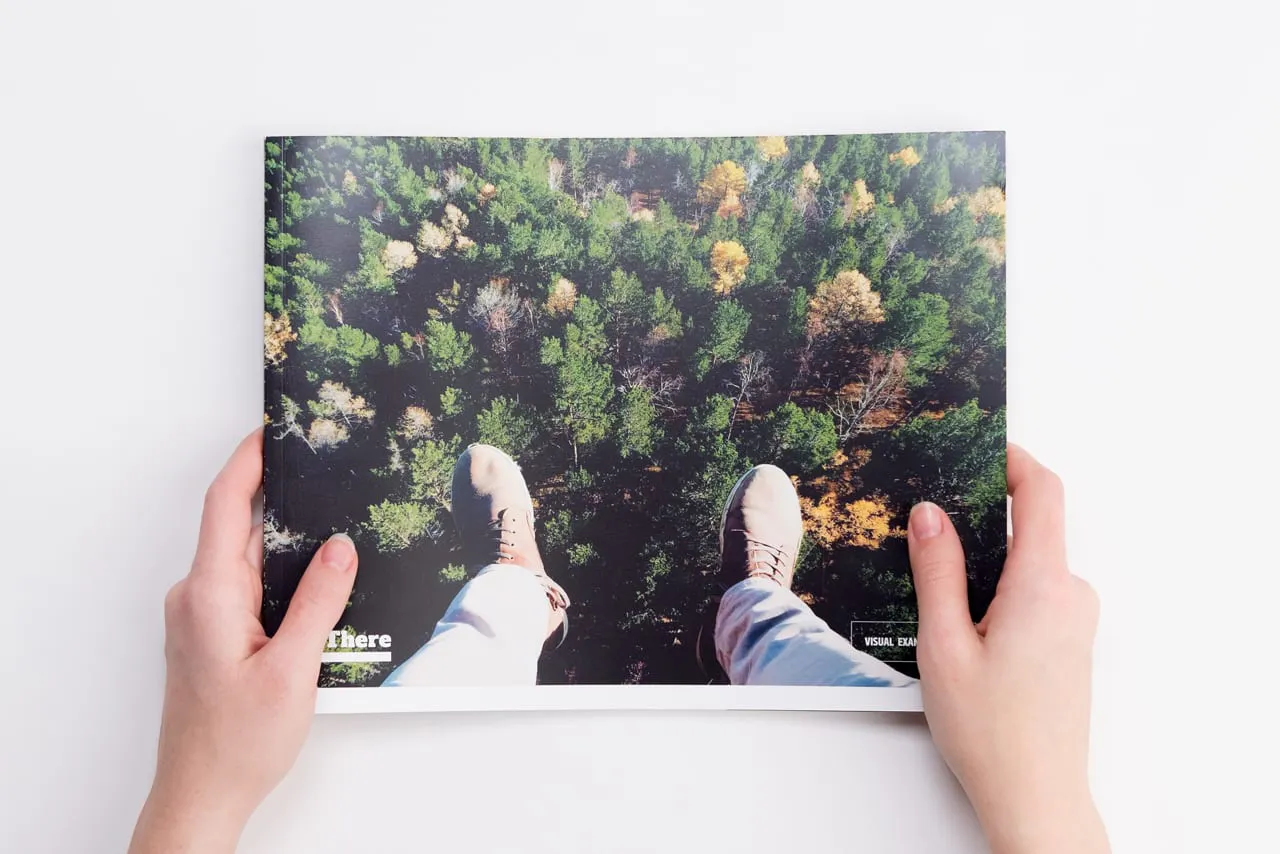
Design Adventure
“It started off with the client from the Colorado outdoor resource, OutThere saying, ‘We need our logo to do more for us,'” Mark recalled. “So, we started out reworking the logo, but it quickly became clear they wanted something a lot more robust.”
“The more we talked, we realized that what they really wanted was a sweeping visual guide that focused on three areas: photography, logo and typography, and finally, color and graphics,” Mark said. “So we started by identifying the three keywords or attributes of the brand and assigned them to the category or section that best fit them – ‘immersive’ for photography, ‘bold’ for logos and typography and ‘energetic’ for color palettes and iconic elements.”
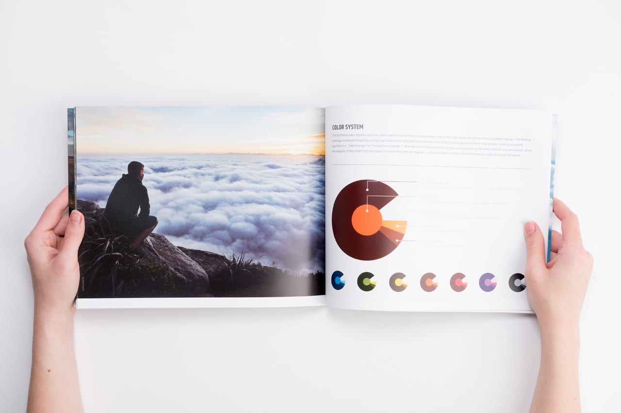
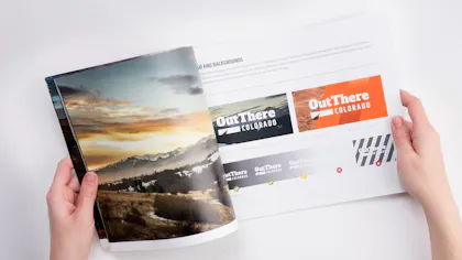
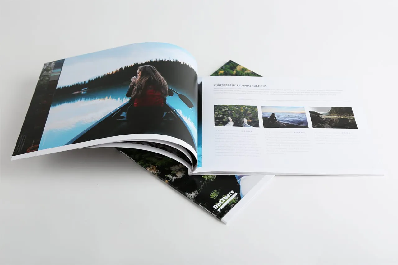
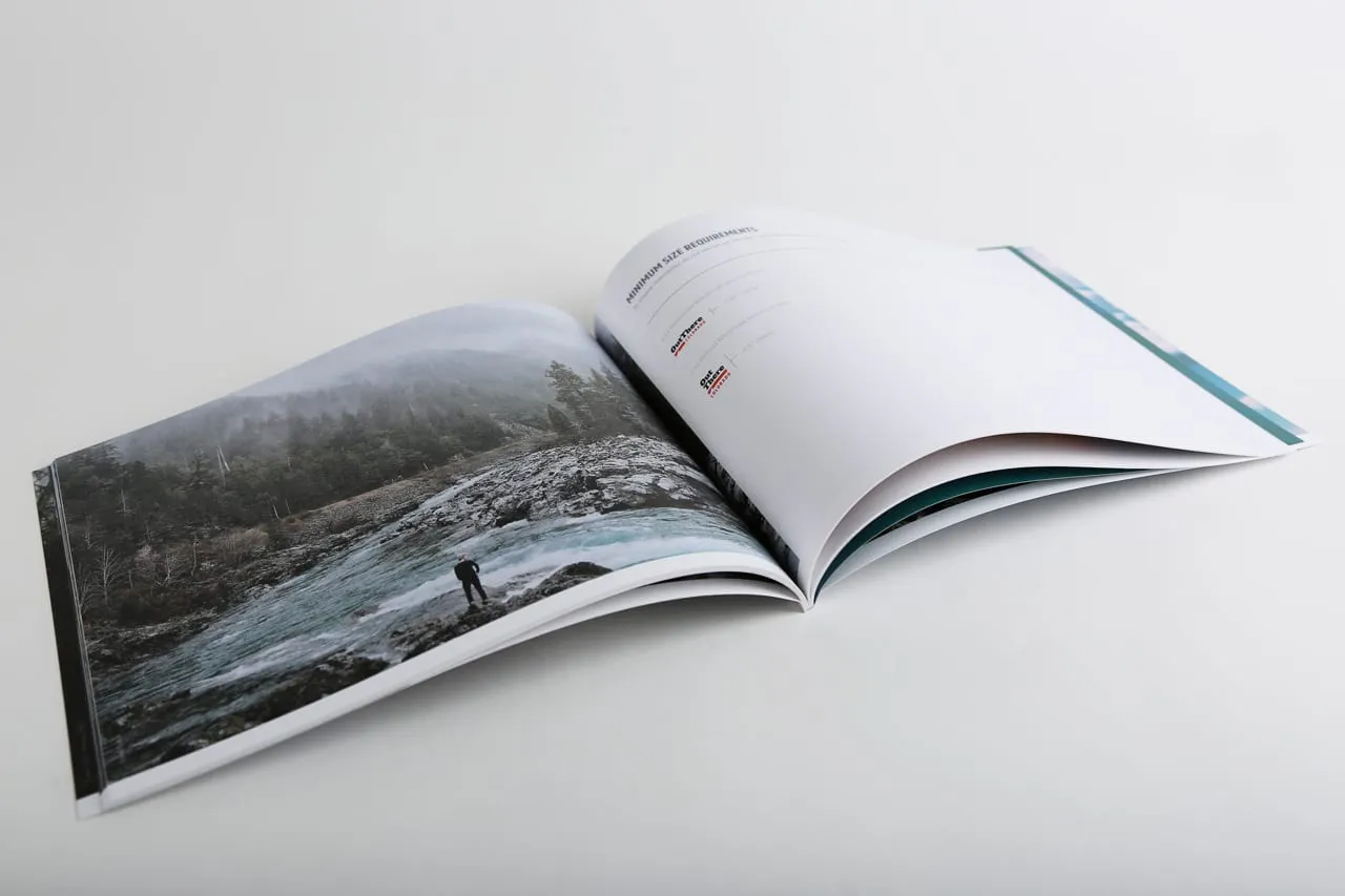
Immersive photography incorporated throughout
Search Party
But make no mistake, there were still several hurdles ahead. “We had an incredibly limited budget,” Mark said. “So, we had to work smart. All of the photography in the book had to be royalty-free which turned into an aggressive sourcing process.”
Admittedly, the biggest challenge was getting the client’s buy-in on the agency’s idea to more than double the original size of the project. “We were like, ‘Hey, I know that we can’t fit all of this into a 15-page booklet. How’d you feel about doubling that?'” he said.
Collaborating with a premium online printer like Smartpress streamlined the design process for the brand manual.
“We went on to explain the method to our madness,” Mark continued. “We wanted the photography to drive the piece, to give viewers a sense of being totally immersed in the essence of the OutThere brand – the outdoors.
“So we proposed creating two: a print version that reserved the left panel throughout the entire book for a photo image that could communicate the brand’s bold, immersive, energetic story and a smaller, more compact, digital version without the left page that could be easily downloaded.”
Using Smartpress’ Perfect Bound Booklets and all the online printing services was also part of the method. Booklet printing was simple with custom options like paper stocks, UV coatings, text and cover weights, full-color ink and more.
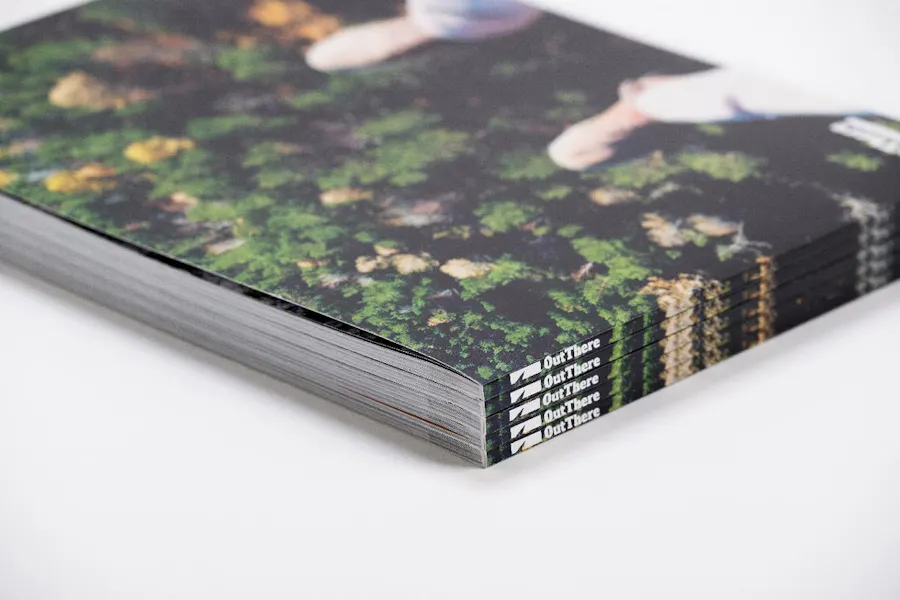
Perfect binding enhances standard format
Stepping Outside the Comfort Zone
Once the client was onboard, Mark started assembling layouts for the brand manual, mindful that the photography would drive the piece, supported by big, bold text and environmentally-rich patterns and colorways.
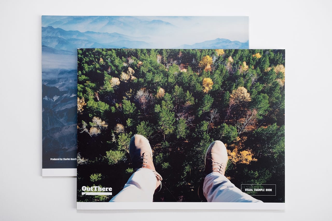
“I settled on a perfect binding almost immediately,” Mark said. “Because I felt it would elevate the standard 11 x 8 format I was working within and would enhance each spread by giving the illusion of unfolding something really majestic and grand.” They also opted for a 100# coated matte stock to give it a bit more substance.
Elevating The Brand
“The visual style guide was definitely more of a collaboration than a compromise,” Mark said. When the piece was finally printed, it was high fives all around. “Holding it in our hands was an absolute treat,” he said. It’s size and weight, the color, and photographs, all of it felt big and bold – just like the brand itself.”
“It’s definitely one of those pieces that we share with clients here at Magneti, who have reached out to us to help them in developing brand style guides,” he continued. “We often say “’There’s the Toyota brand style guide and then there’s the Tesla version. Want to see one of those?’” and we pull out our OutThere sample guide. No question, we’re proud of it.”
Hint: Dive into your own brand manual with our other booklet printing options: